Startbahn・January 2022 - March 2023
Startbahn・January 2022 - March 2023
Leadship · UI Redesign · UX Research
UI Redesign · UX Research
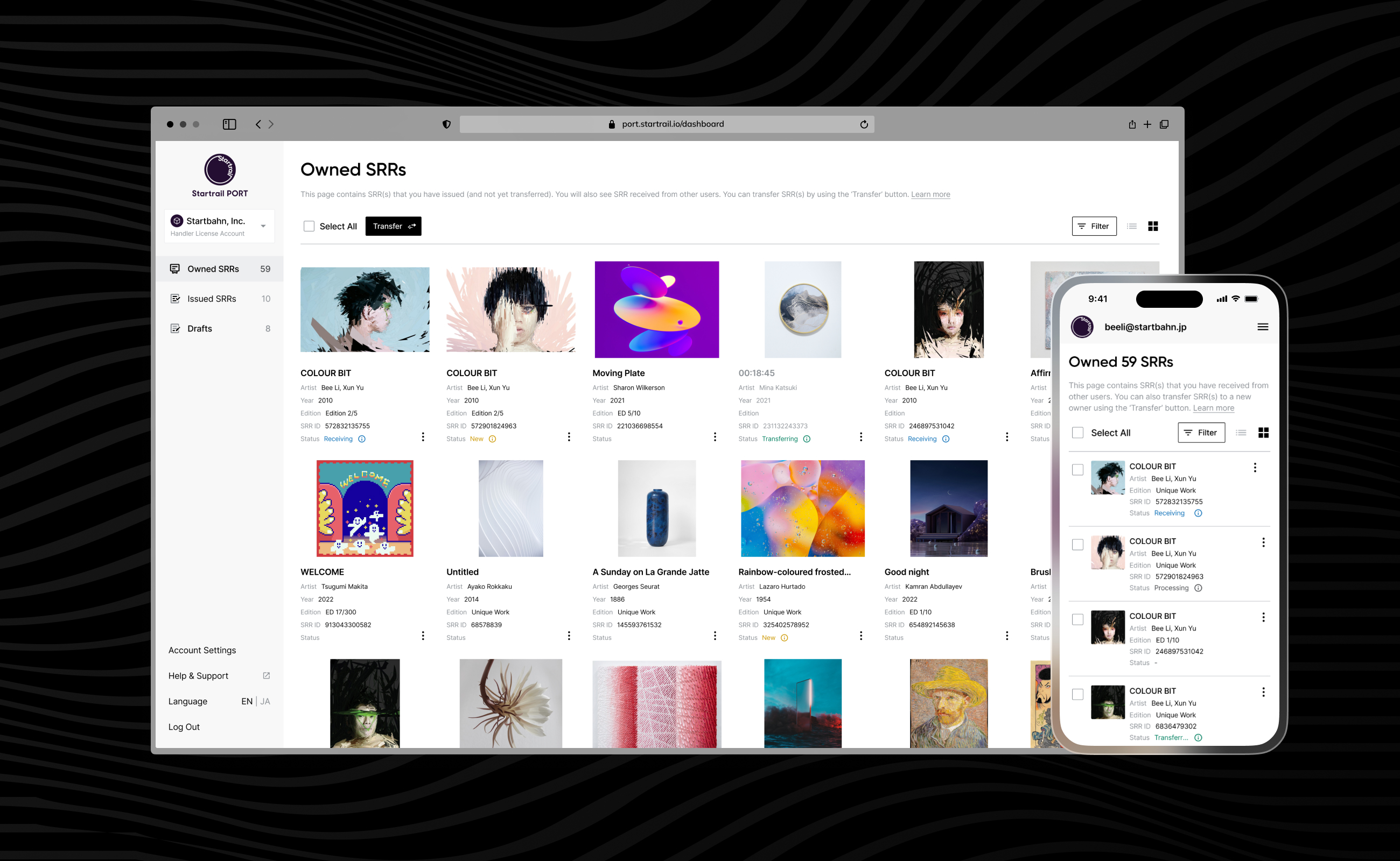
Redesign an all-in-one dashboard for authentic digital blockchain certificates for physical and digital art.
Redesign an all-in-one dashboard for authentic digital blockchain certificates for physical and digital art.
Duration
6-10 months
My Role
Design Lead
UI/UX Designer
Responsibility
Leadship
End-to-End Design
Made with
Project Overview
1 | Role & Deliverables
I worked with a PM, 2 designers, and 3 engineers on this project closely. I led an overall UI design and UX implementation, from defining the users' pain points to visual artefact delivery.
2 | Objective
Revamped the dashboard and enabled it to solve critical UI and UX issues and user flow based on the new branding systems and framework migration from NUXT JS to NEXT JS.
3 | Challenges
This project had some technical dependencies with the old frame system; also needed to consider the constraints of the Polygon blockchain and web3 wallet infrastructure so that we could deliver the revamped design on time.
4 | Outcome & Impact
The soft launch renovation had began from Nov 2022; the main features were delivered by Mar 2023. Improved metrics: 26.7% higher user satisfaction; resolved 15+ UI&UX issues and led to 3 fundamental feature improvements.
26%
26%
increase in user satisfaction
63.3%
63.3%
Feel cleaner, neat and informative
27.3%
27.3%
Like full-size images are shown in the frame
25%
25%
Rated status column is handy &helpful
Background
Startbahn provides a sustainable and scalable blockchain infrastructure that allows for creating and issuing authentic digital blockchain certificates & NFC chips for both physical and digital artworks. These certificates can be used to track the ownership and provenance of artworks and to ensure their authenticity.
In 2021, Startbahn partnered with several major brands, including Shueisha, SBI Art Auction, PLM, Tokyu, and Toyota, as well as well-known creators worldwide, to offer authentic blockchain certificates. The company also grew its user base and the number of certificates issued through a successful cultural and NFT collecting event called Moon Art Night Shimokitazawa.
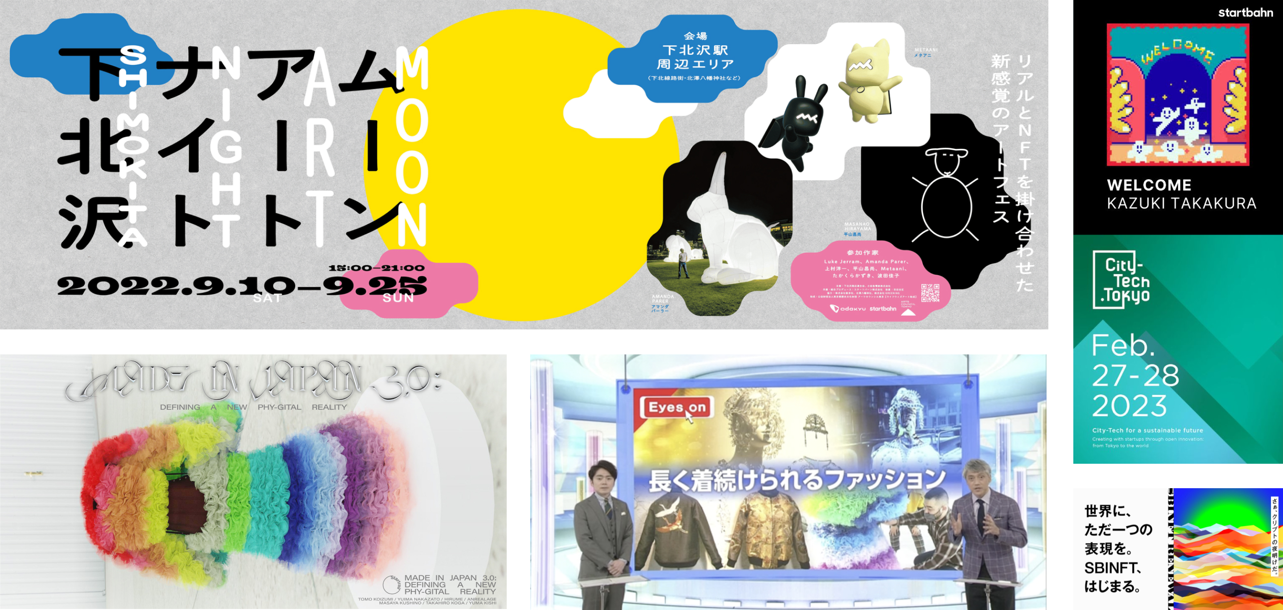
Photo credit all rights reserved Startbahn
The legacy of the certificates dashboard looks too simple, unstructured, and outdated, with many UI/UX problems. Most of the clients are confused about the service and capabilities of the web platform.
Design Process
Design Process

User Research
As a design lead, the design team and I discovered numerous UI and UX bugs in the dashboard that have persisted since 2020. To better understand our users, we conducted user research such as user interviews, customer surveys, user personas, GA, MS, and a service blueprint. Here's what we learned.
User Research 1
User interview
Key finding 1:
The UI of the dashboard is difficult to use and outdated due to the nature of the NFT industry.
1. Artists and collectors often find the user interface (UI) difficult to use. They may have trouble finding the information or completing the tasks they need to do.
2. Many features require manual processing by the customer support team. This can be time-consuming and frustrating for users.
3. The status of SRR (Startbahn Request Record) is difficult to understand, especially the "In progress" status. This can lead to confusion and uncertainty for users.
4. The site does not inspire trust as a decentralized and web3 service. This is because the UI is difficult to use, there is a lack of transparency, and the customer support team is slow to respond.
Key finding 2:
The readability of the certificates was clunky and cluttered on the desktop and mobile screens.
1. The design of the certificates (SRR) page is outdated and does not reflect current design trends.
2. Some of the text on the certificates is difficult to understand. For example, I do not know what "history" or "SRR" means.
3. The certificates page looks cluttered and difficult to use on the desktop and mobile screens.
4. It would be helpful if the certificates page could also be sorted by event or long content, such as sorted feature of the artwork activity of OpenSea.
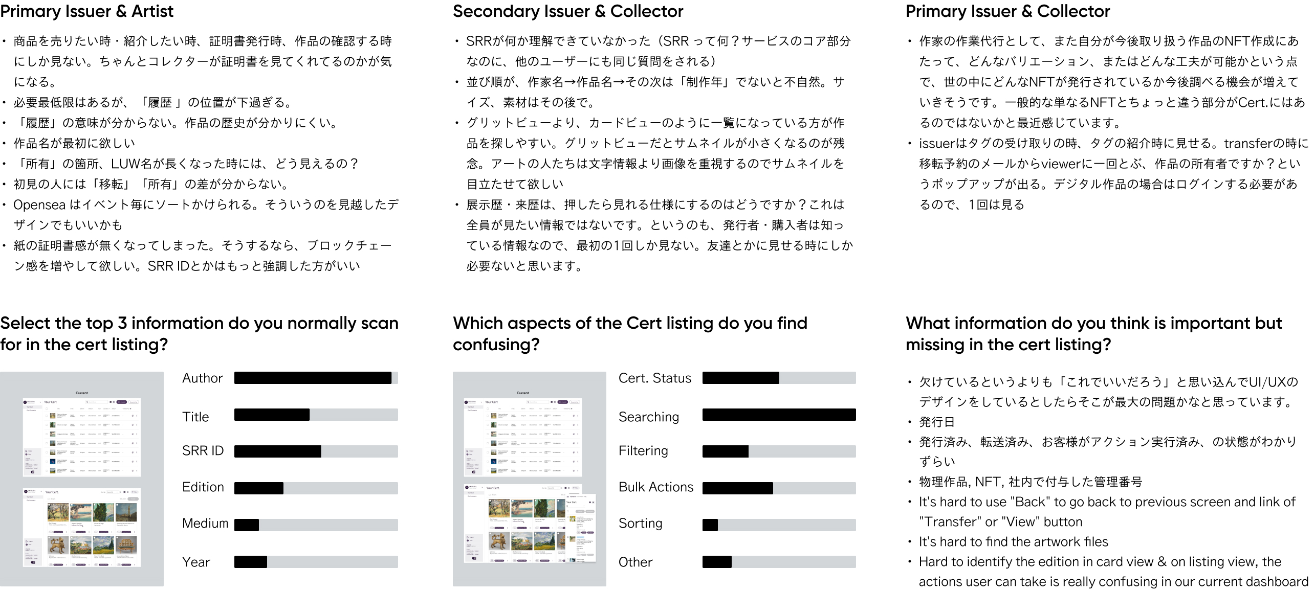
16 participant and collected in February,2022
User Research 2
Google Analytics
Google Analytics
Google Analytics helped us with some quick insights and provided significant matrices. We noticed that the web app was encountered more than 50% of Apple users, and 45% of Apple users used the Safari system. On the contrary, In 56% of the mobile users, there were 81.7% were iPhone users. Also, we had 34% direct traffic from the certificates page and 62% of drop-offs after landing the dashboard.
50%+
Apple devices users
56% +
Mobile users
34%
Direct traffic from Crtificate pages
1000+
increasing new visitors monthly

Data collected from January 2021 to December 2021
User Research 3
Service Blueprint
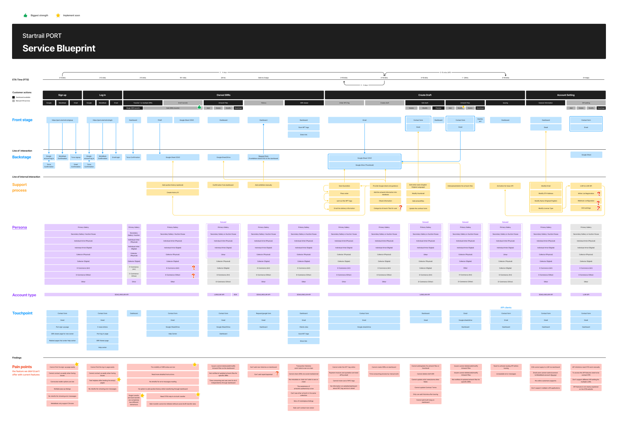
The service blueprint also identified that customers had difficulty finding the login/sign-up page and could not smoothly access the accurate status of certificates and certificates creation, as well as a complex transfer flow of the certificates. This indicated many pain points that the front stage of service couldn’t offer clear instructions and relied on countless offline dependencies such as Google From or the inquiry service of the website.
User Research 4
User/Customer survey
The user/customer survey also helped us to learn more about the customers as we want to take away the following key points, Customer goals, Customer pain points (feedback), Good points of our service, Needs for the future. We had 85 respondents and more than 40% of the Customer were Artwork Collector, 27% of the other users and 16% of the Artist/Creators, respectively.
Problems framming
The conclusion of the problems for users
1. Cluttered visual hierarchy
The visual hierarchy and glossaries are cluttered for both the certificate page and dashboard in a confusing manner.
2. Simplified & easy to access dashboard
The dashboard can be well structured to provide clear and structured instructions and information about the certificate or simplified navigation and action flows.
3. Unclear and manual procedures
Numerous actions required offline & manual procedures, which took a lot of time for users to finish their actions as well as the back-and-force communication burdens

The Product Legacy of The Startbahn PORT
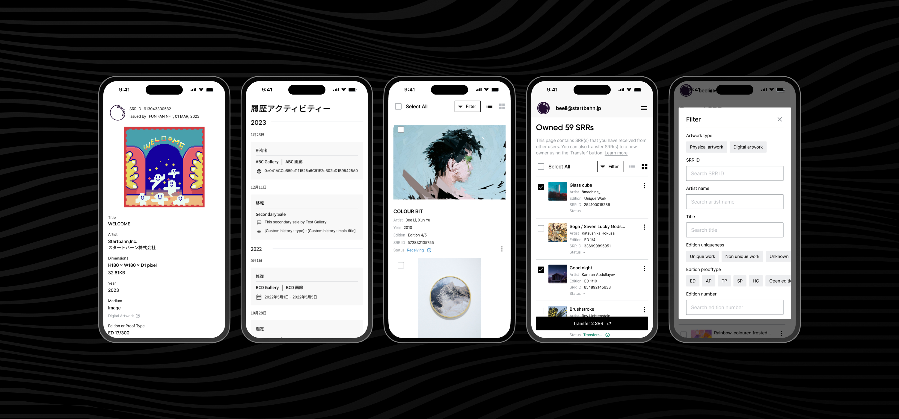
Overall screens on the mobile devies
Final Design
I led countless discussions and meetings in 6 months across teams based on the insights of research and feasible scope and deliverables definition. The final design included:
1.
Visible and tangible view experiences
2.
Better accessibility and information hierarchy of the dashboard
3.
Concise labels of the navigation and CTAs (call to action)
 Mobile Web First
Regarding the research, we know we have around 1000 new visitors via the website, and 56% of direct traffic came from mobile devices, and the following outcomes are focused on mobile screens.
Design Principles
I spearheaded the UI redesign process, beginning with the certificates (SRR) page and extending to the dashboard, transfer function, and certificates (SRR) page editor. The goal was to create a modern and industry-appropriate design that prioritized clear information visibility and seamless mobility.
1
Restructured visual cues for the certificate page
2
Better and consice information order on the dashboard
3
Refine user flow & lead to clear call to action
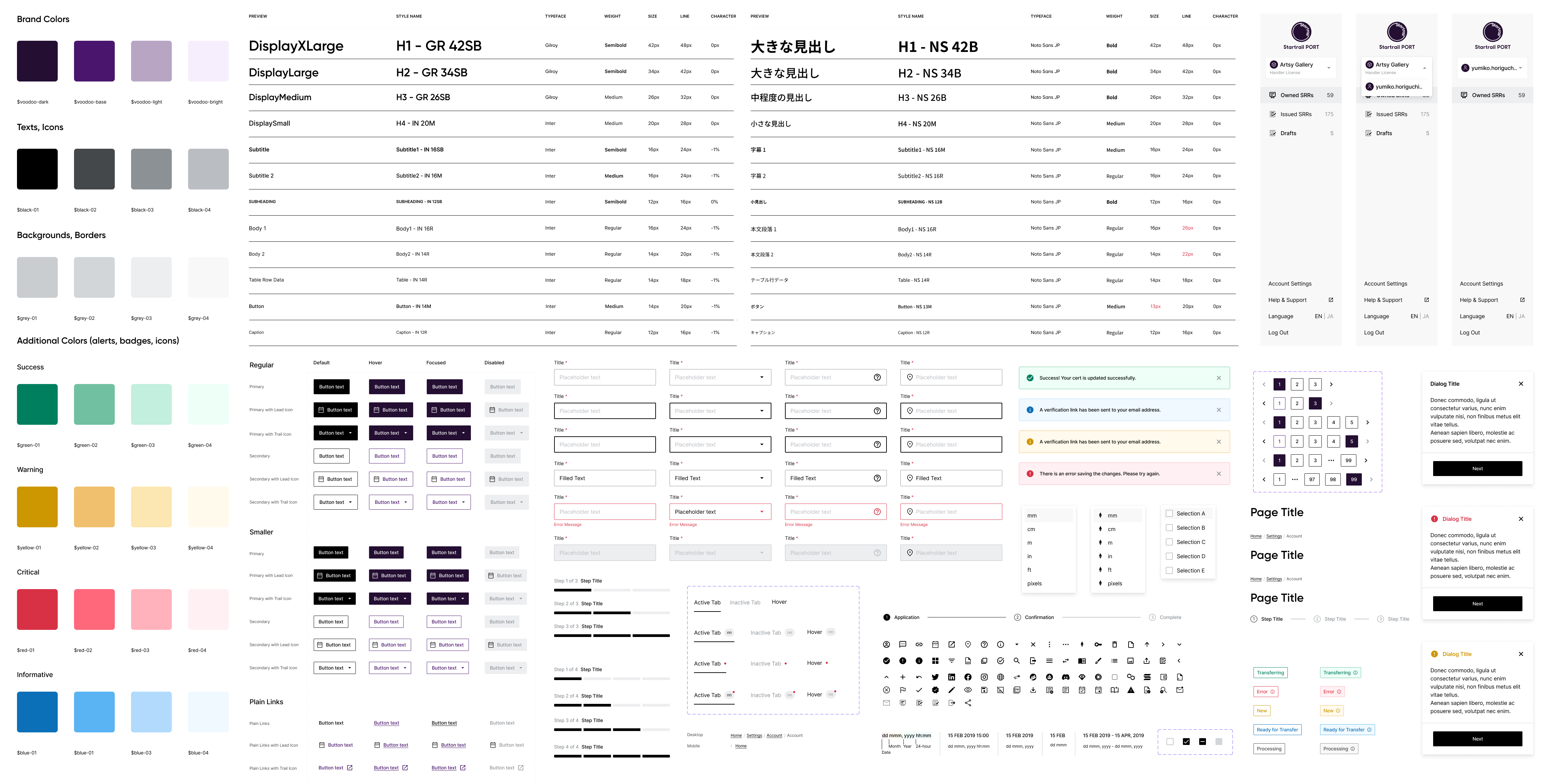
Design System is contributed by three designers
Design Deliverables 1
Restructured visual cues for the certificate page
Improved visual hierarchy and cues of the certificates (SRR) page.
The renovated design used clear and concise labels, colours, and fonts to help users quickly find what they are looking for. Additionally, the new design is responsive and scannable, so it looks and functions well on desktop and mobile devices.
The certificate on the mobile screen is way clean and concise.
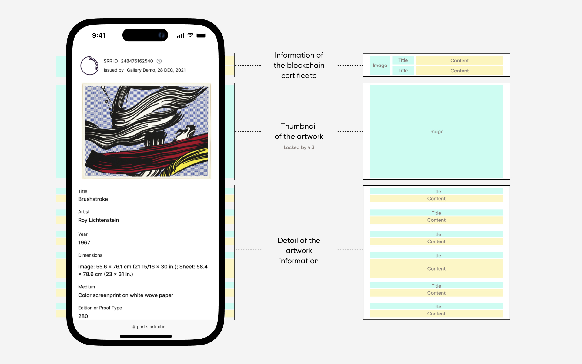
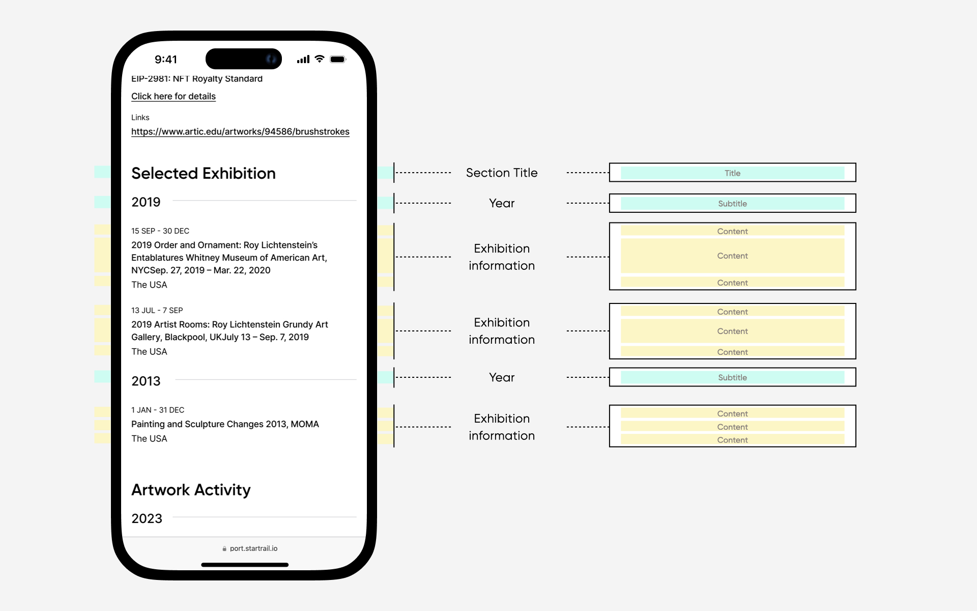
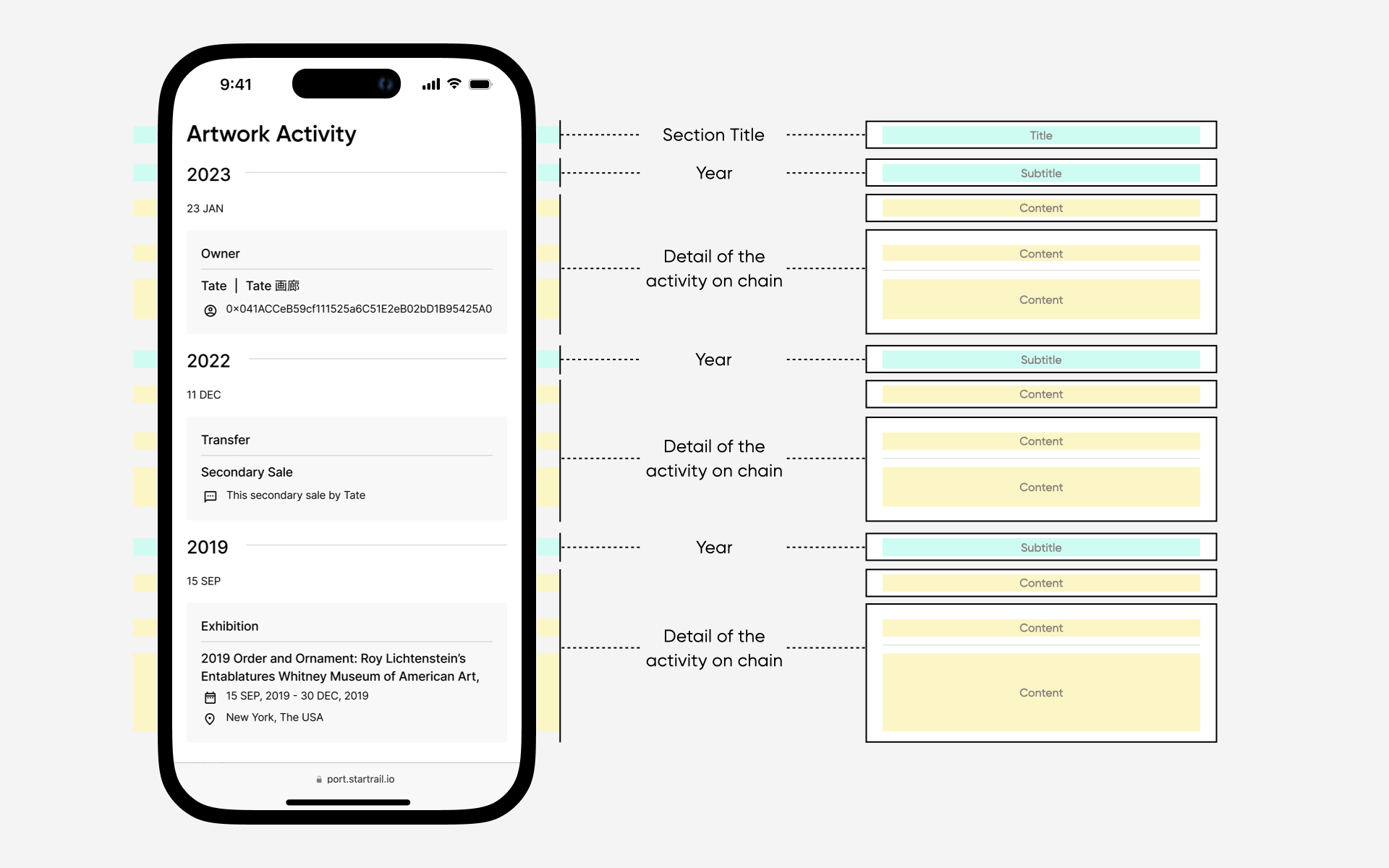
The importance of the certificate page was readability and visualize the information architecture. Based on the different content, we defined the section with clear semantic labels and content pairs that allows individuals to locate and comprehend the information they seek quickly.
Unified UI and design language are applied rest of the size.
The page applied clean, neat, unified, consistent UI styles and cues for information. Artwork information, Selected Exhibition, and Activity followed a precise order. Each session flowed distinctly, visualizing traffic from top to bottom and left to right.
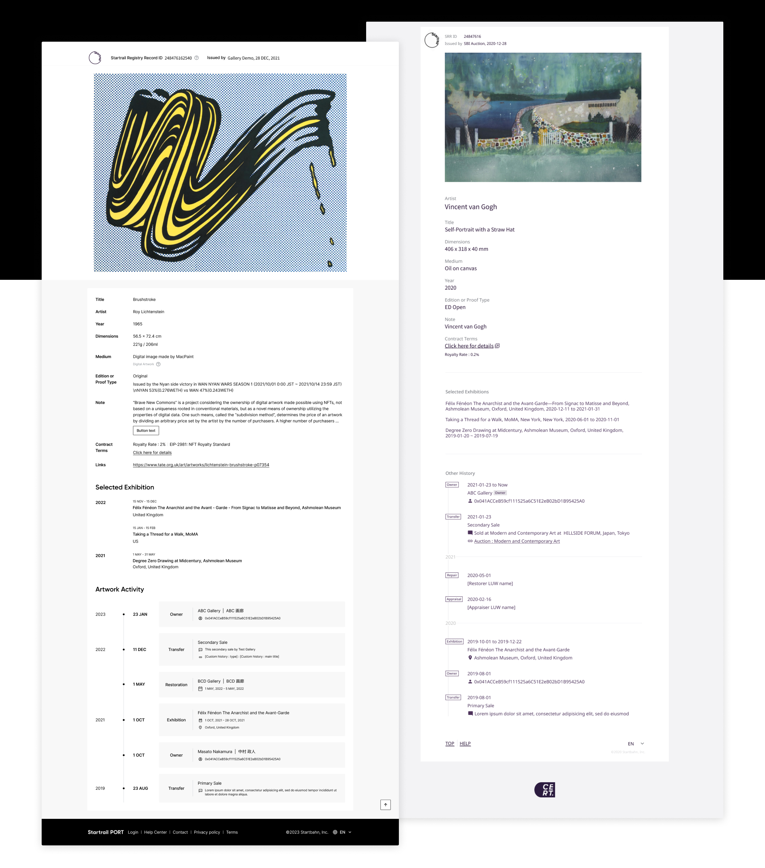
Current Design & Previous Design
As research outlined the massive mobile and Apple users, defining the layout and information structure also was a important topic when browsing the page, particularly on the mobile devices.
Design Deliverables 2
Better and concise information order on the dashboard
Design Deliverables: Dashboard
Better accessibility and information hierarchy of the dashboard
The redesigned dashboard also offered a clean, trendy and neat in detail manner. Based on the research, we know artists and collectors have trouble accessing the different information of certificates on the card and list view. Based on the list and card view, we defined essential information such as the name of the title and artist, year, edition, issued date, certificate ID and precise actions.
List view & card view on mobile devices
We recognized the significance of users accessing essential information across various devices. Therefore, we prioritized ensuring that limited information remained legible. The artwork's title, artist, year, edition number, certificate ID, and status are vital card and list views.
We used to have a lack of details for both views on mobile; the new version defined what the essential information in the card and list view were.
Also, the renovated dashboard outlined more visible details. The revamped version displayed more important information, such as the name of the issuer, number of the files or the status.
Adaptive design that applied different screens
Defining the layout for both card and list view was also a significant resolution for the design team. Originally, we'd like to bring consistent and seamless experiences across devices.
Design Deliverables 3
Concise and compelling CTAs that guide users towards optimal functionality.
Design Deliverables: Dashboard
Clear Primary and secondary tasks for each page
The customers were experiencing confusion regarding available tasks on each page, and the redesigned dashboard aimed to identify primary and secondary actions based on the pages.
Users can now experience a streamlined UI by implementing optimization and iterative improvements. By selecting the certificates and the CTA button can show up to continue single or bulk actions seamlessly. Also, secondary tasks can be found via the 3-dots icon.
Transfer action for the Owned certificate (left),
Add Exhibition History action for the Issued certificate (centre), and
Issue action for Draft (right)
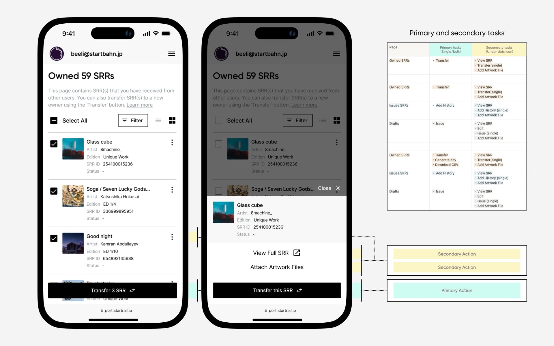
The UI difinition of the Primary and secondary tasks
Learning & Takeaway
26%
26%
increase in user satisfaction
63.3%
63.3%
Feel cleaner, neat and informative
27.3%
27.3%
Like full-size images are shown in the frame
25%
25%
Rated status column is helpful
ChallengesThis project started in December 2021, and most of the designs were delivered by June 2022, but it was a challenge for the team and it took a lot of time to discuss the scope and requirement definition so that we could softly deliver on the production. As a designer and lead, I tried to analyse the technic constraints but also encountered the troubles of team leadership and workflow management. Regarding my initiation of redesigning the certificate page and dashboard, we, the design team, resolved more than 15+ UI&UX issues and led to 3 more fundamental feature improvements that got more approval for execution on the team roadmap.