SPEEDSMITH・November 2017 - April 2018
iOS design · Research · User Testing
iOS design · Research · User Testing
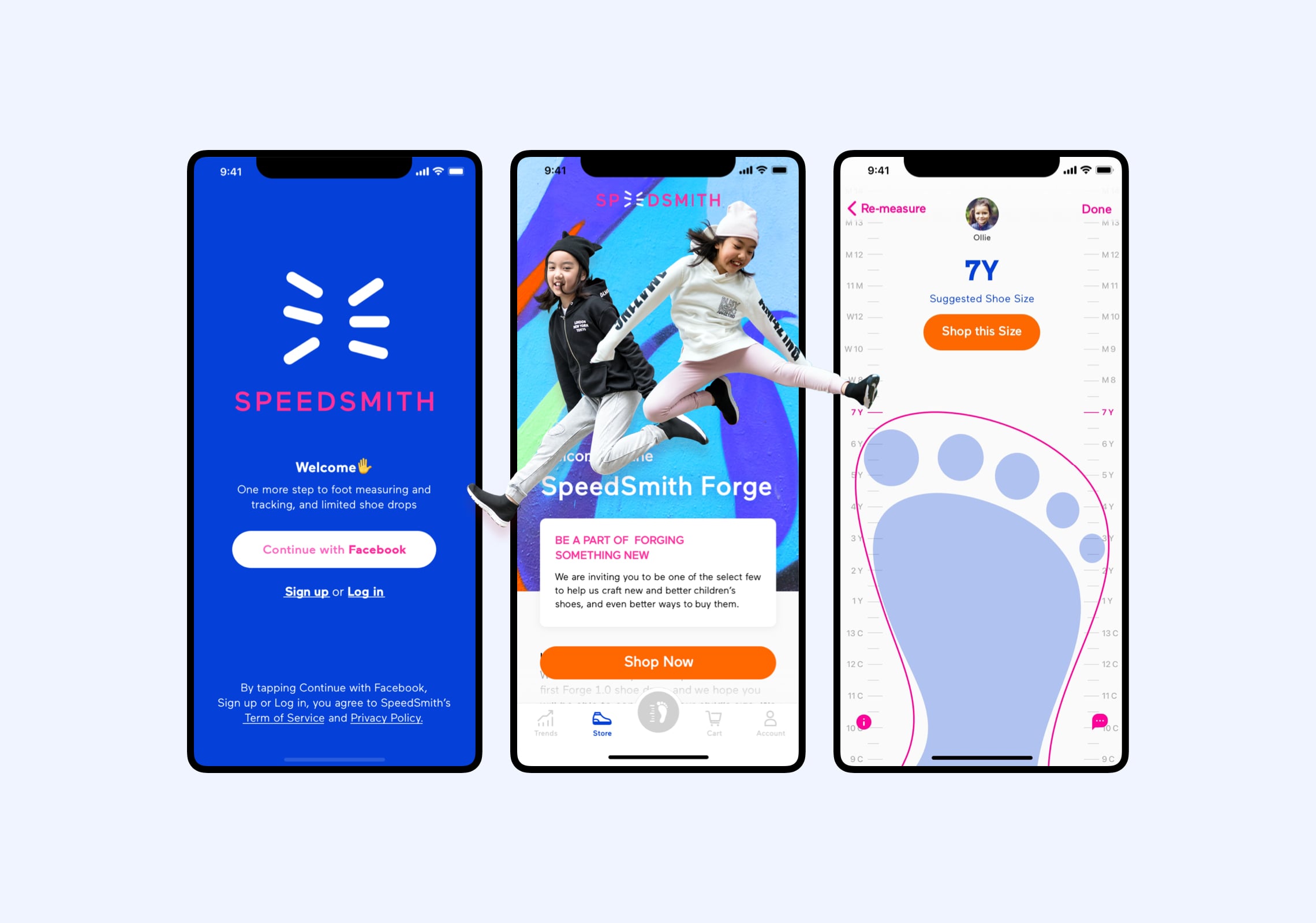
The most accessible measurement and shopping app for children’s foot
The most accessible measurement and shopping app for children’s foot
Duration
6 months
My Role
UI/UX designer
Responsibility
End to end UX/UI design
Made with
Roam & Wander
Context
SPEEDSMITH was a startup that designs super-functional and stylish sneakers for children who were aged 3 to 12 in all kinds of activities and environments. However, the progress of children's growth can be complex and overwhelming for different stages of parents.
I was tasked with providing a mobile application that would allow surfers to find an easily understandable and accessible iOS App that would help parents find better shoe size recommendations for quick-growing children's feet.
Process

Research
Competitor Analysis
To get a better understanding of the competitor landscape, I conducted analyses on a few well-known services/Apps on the market, such as Apple Measure, Nike and ZOZOMAT; I found that there were rare services that focused on children's feet and most features.
Surveys & Interviews
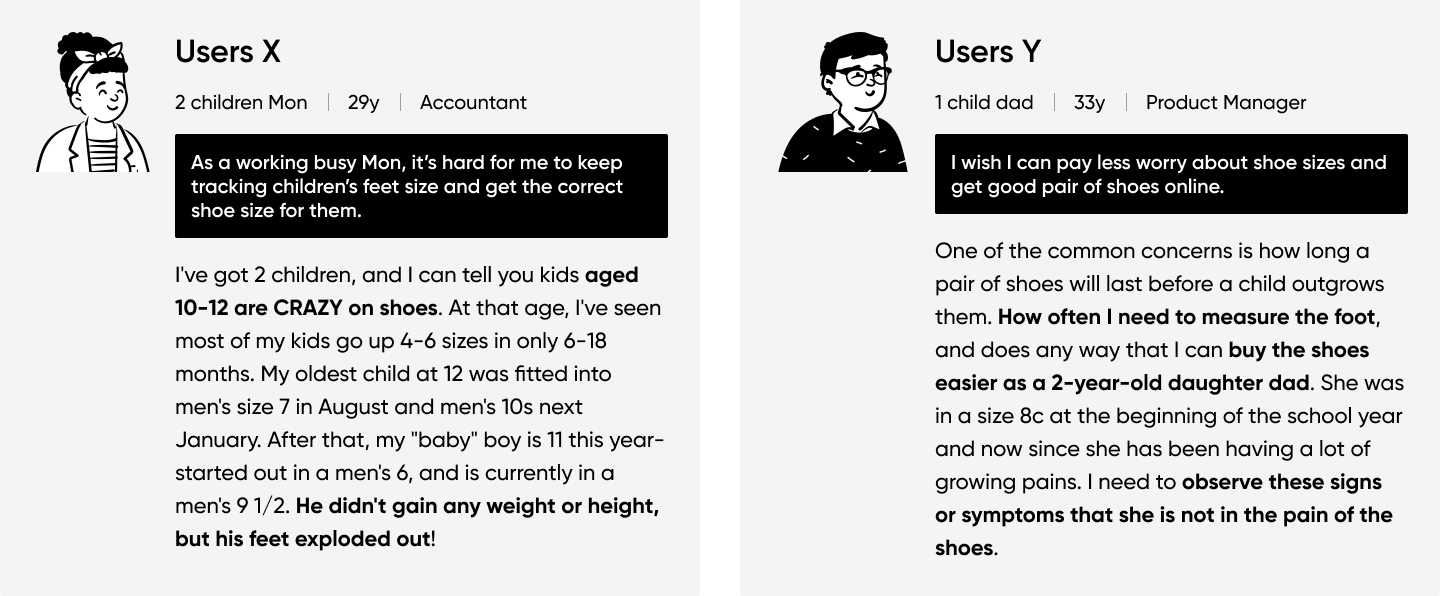
To understand how parents knew their children's feet and shoe sizes at an early age. I surveyed 10 parents at different levels of parents’ lives as well as concerns, needs and pinpoints. The finding was focus on Beginner and Practicedparents.
Define
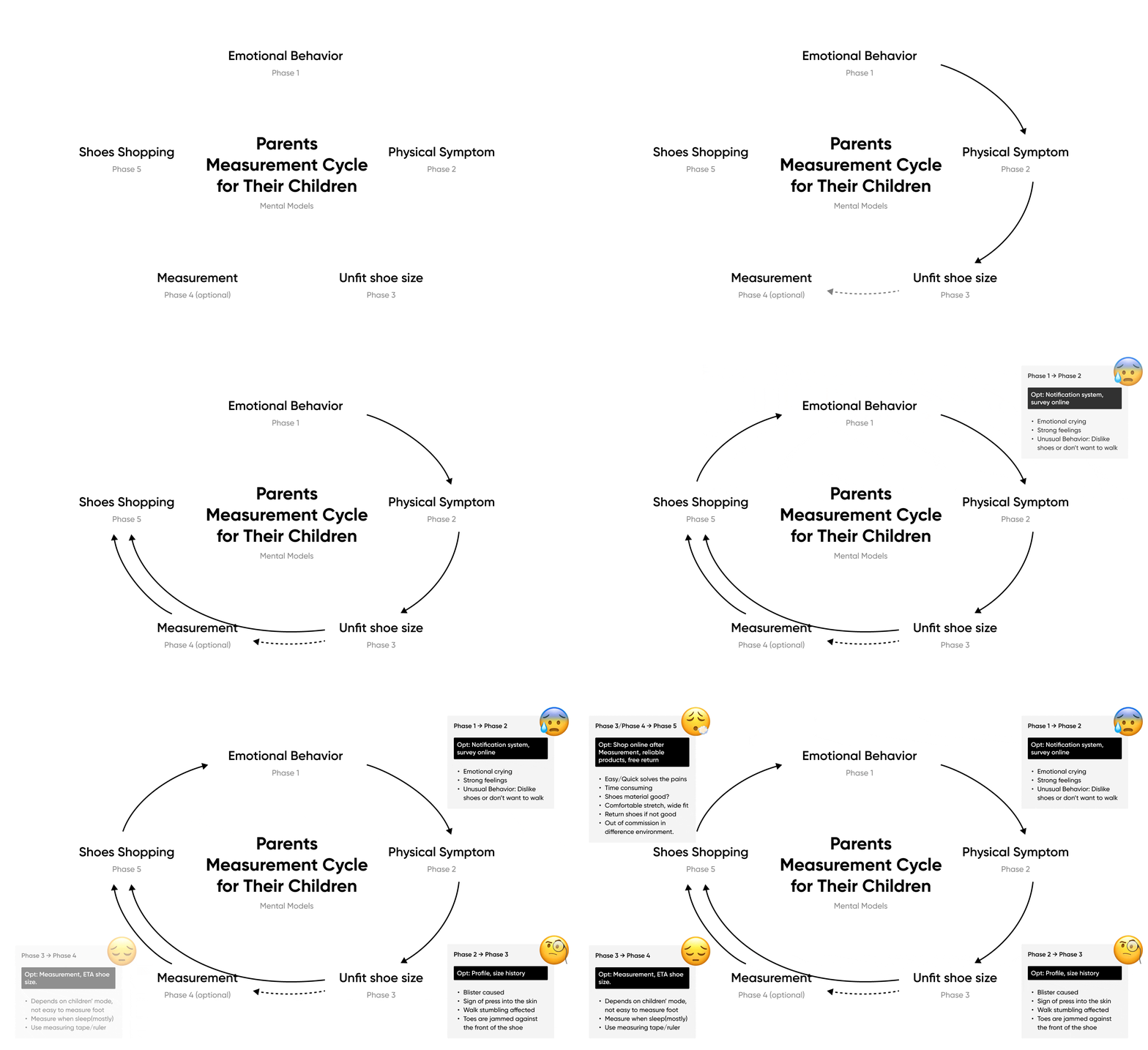
Measurement Cycle
Based on the collected research and user interviews, a mental model for each user persona to understand how the user might interact with the app, and to create a more intuitive user experience.
Problem Statement
How might we help busy parents to relieve the measurement period of feet and shoe size frustration?
- Allow the user to explore and interact with SPEEDSMITH app and help invoke an enjoyment feel in the mobile app.
- Make measurement feet very easy to reach out for help, record and ensure the parents are aware of the wide range of services offered by SPEEDSMITH.
- Provide a way for a highly usable shopping experience for parents to buy shoes for their young children.
User Flows & Task Analyse
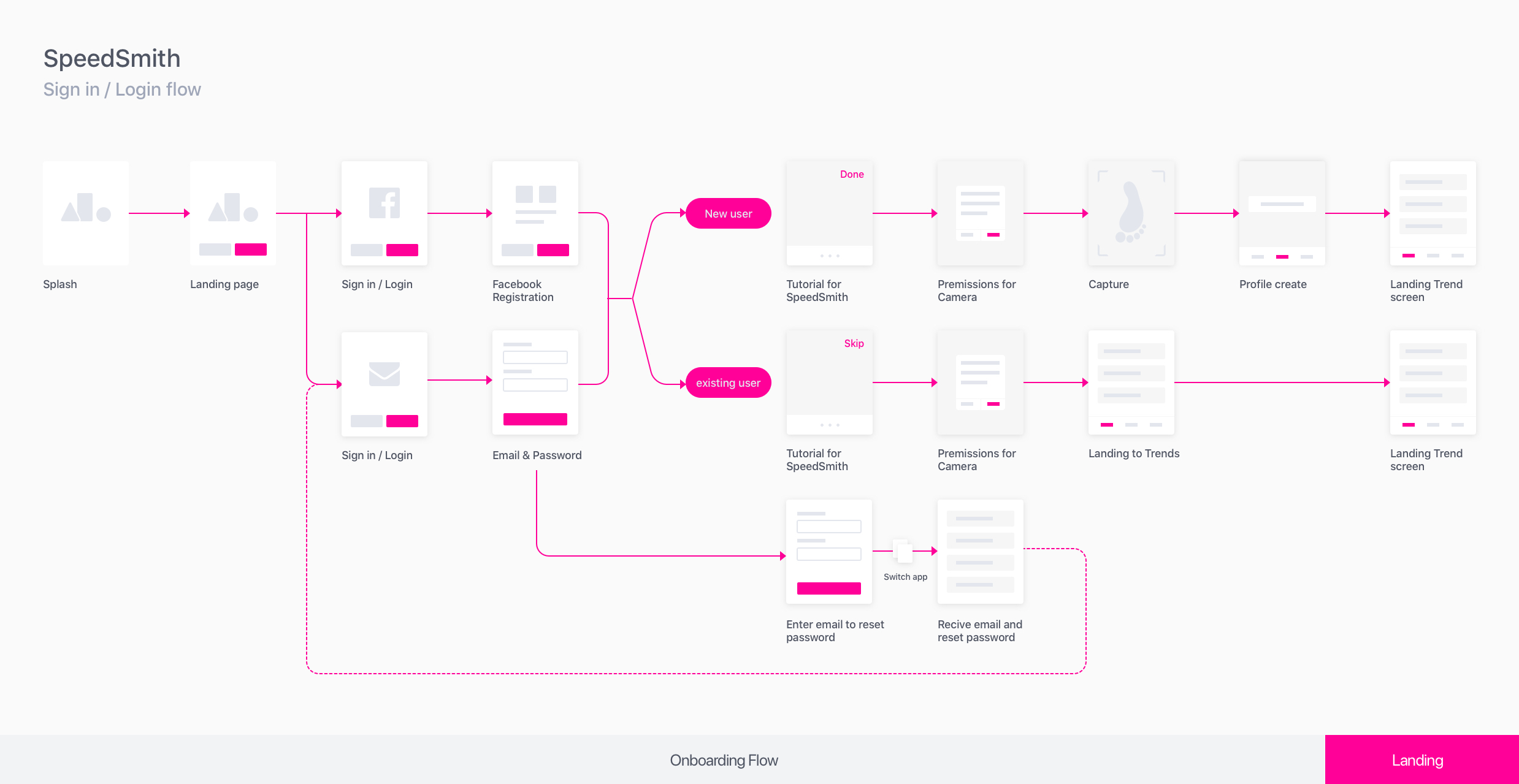
The following User Flows & Task Analyses gave me a clear picture of the steps that the user would need to take to get to their final goal and how to deliver the goals in the effective manner.

Core Features
With a better idea of my users and their needs, three core features were identified that I wanted to focus on for the product and also channel pain points to solutions.
Accessible Profile
A profile allowed users to browse all the measurement results before, now and feature.
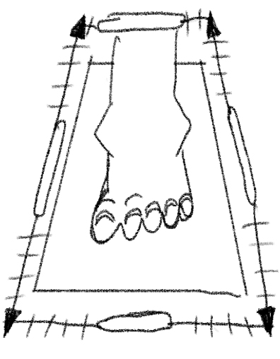
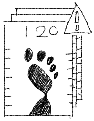
3D measurement
An easy capture feature could offer the feet size precisely.

E-commercial
Users can directly saw the recommended shoe sizes after measurement.
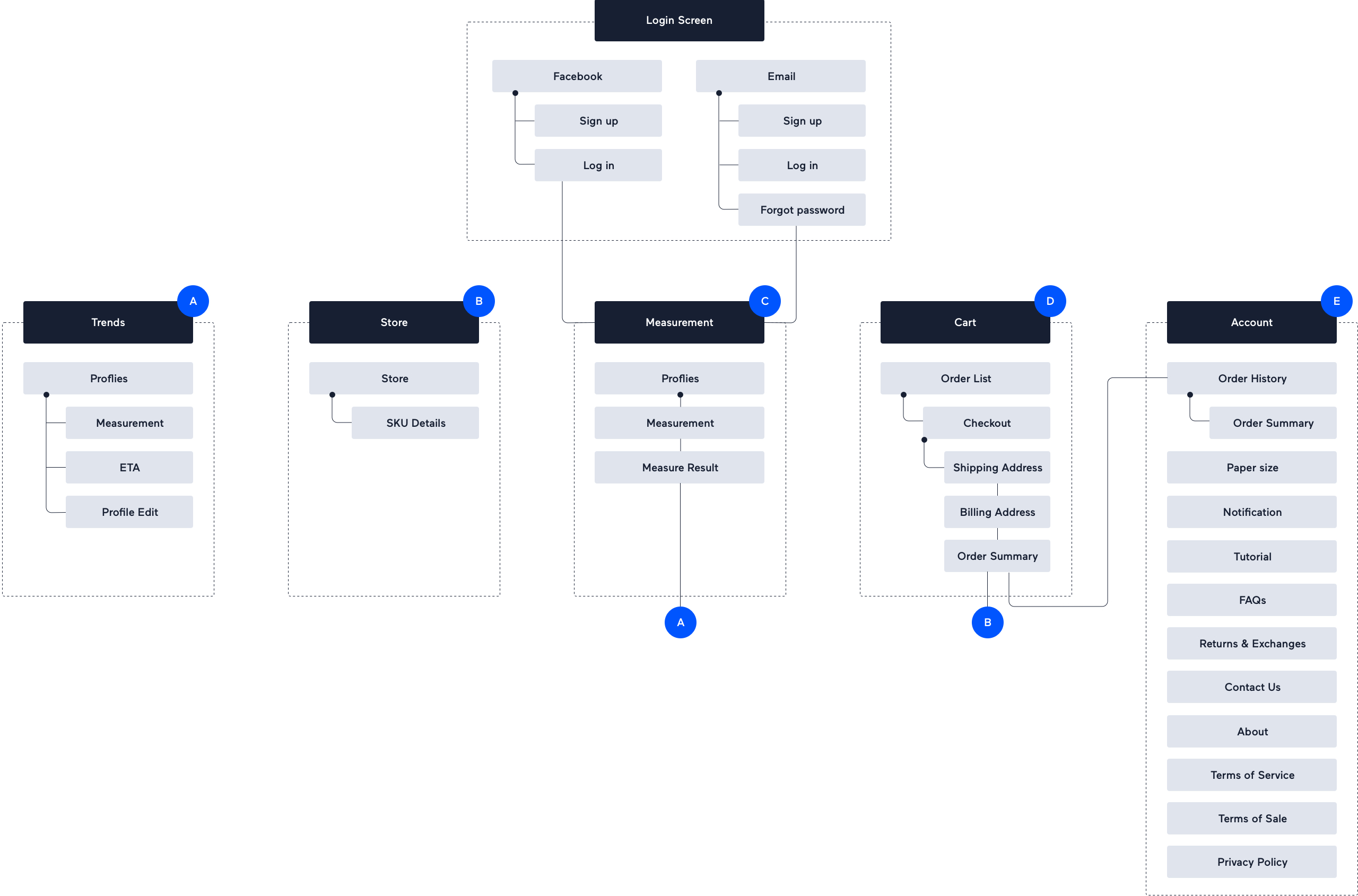
Sitemap
I conducted a card sort to gain insight as to how users might expect the content to be organised and adopted the results by creating a clear sitemap.
Ideat
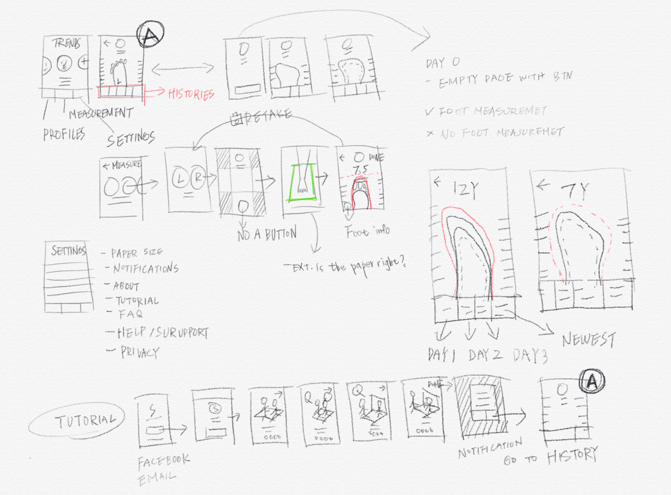
Low Fidelity Wireframes
Since simplicity and ease of accessibility were one of the biggest aims of SPEEDSMITH, and I wanted to focus on the core features as well as managed to convey my imaginations in drafts.
Usability Testing
This phase allowed me to observe users’ behaviour and adjusted the design by conducting usability tests; I could be able to refine what users were useful or odd flow and completely changed up what they did not react well.
Key Findings
Positive
- Users enjoyed the onboarding flow so that they could measure their feet immediately.
- The features were overall easy to understand
Negative
- Users did not expect the camera to capture the images automatically.
- The indicator of screens was not clear enough
- The feet sizes and shoe sizes are confused.

Final Delivery
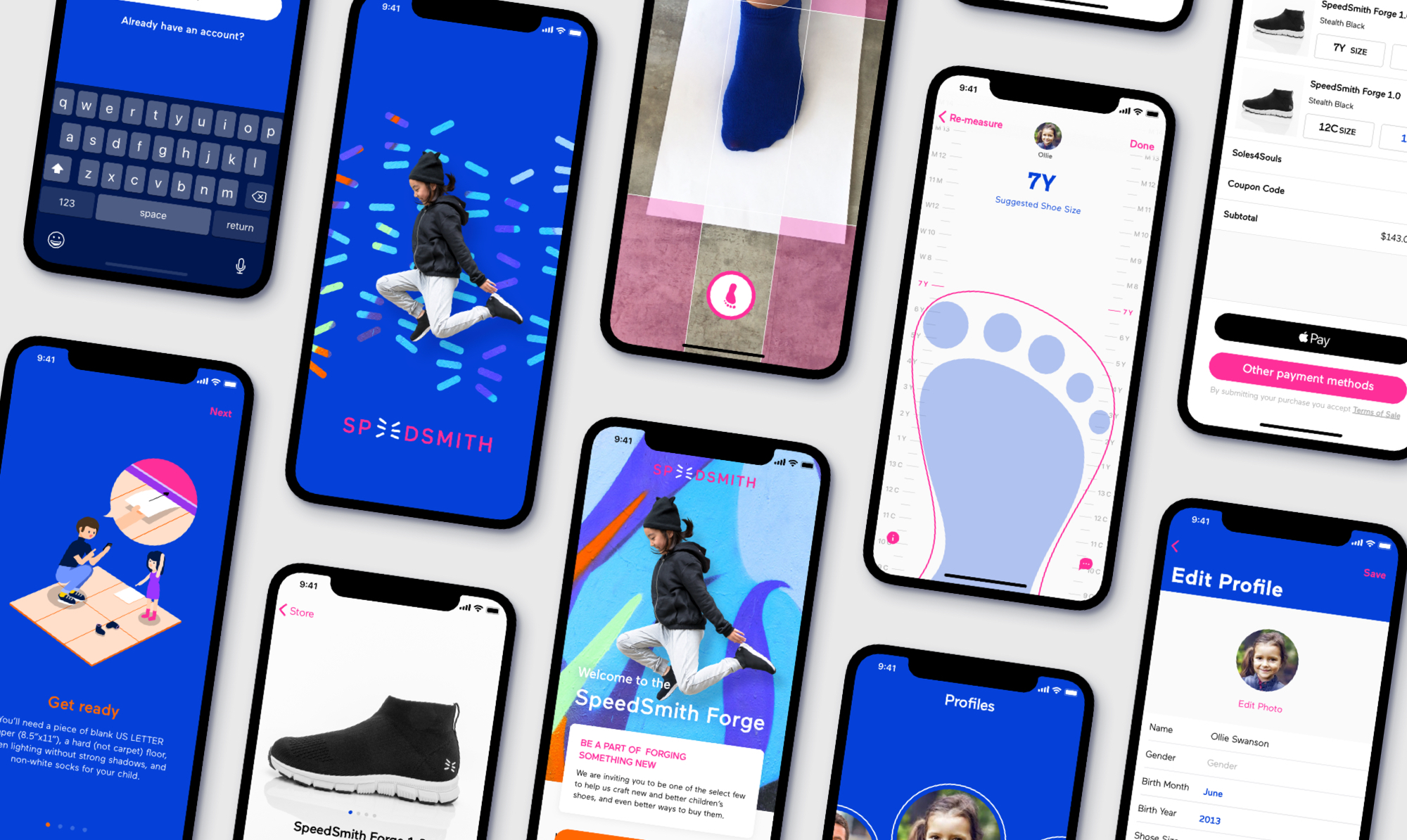
The final design was defined and synchronized new branding of SPEEDSMITH and business strategy. We indeed wanted to solve parents' pains, especially new and busy parents, making the app as simple, and concise but accessible as possible.
Iterate
Onboarding flow
As the client and I had the same design of point with tutorial screens, we aimed to focus on how to use the app and what results could be received with a charming illustration.
Profile
We knew how important to give a record for each measurement. This screen was built for size history; users could have a better understanding of the latest size and when they can reach the next size.
Feet measurement
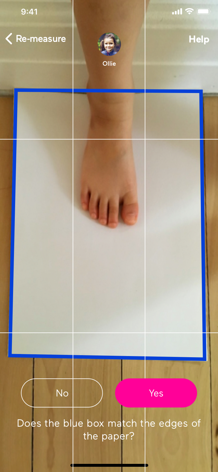
We were not just solving the user’s needs but also aligned the customers’ business values. While users were highly engaged, we believed that users would be fascinated by an auto 3d capture, so it should be the best timing for offering action for users to shop the Speedsmith’s shoes. The button led us to the shopping screen with an accurate size after measuring.
E-commercial
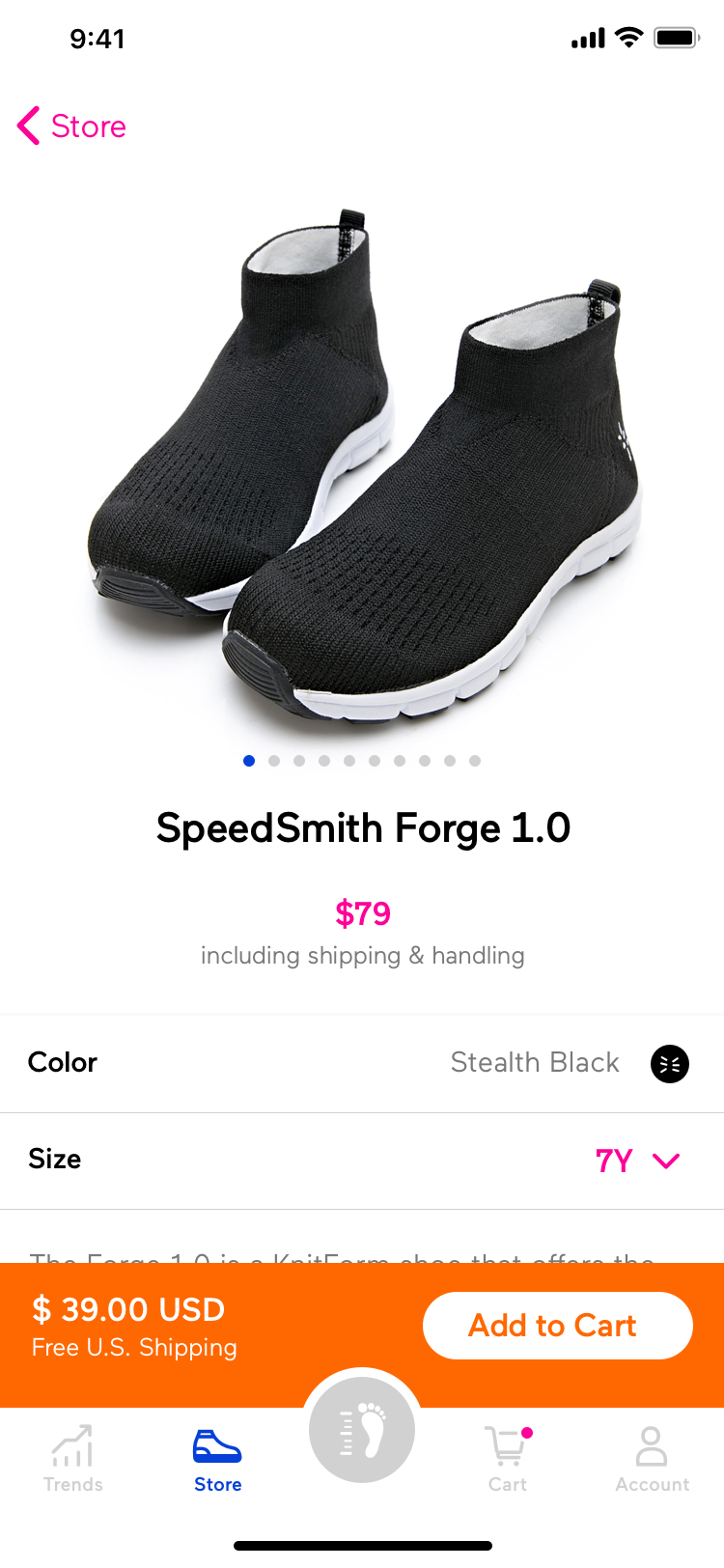
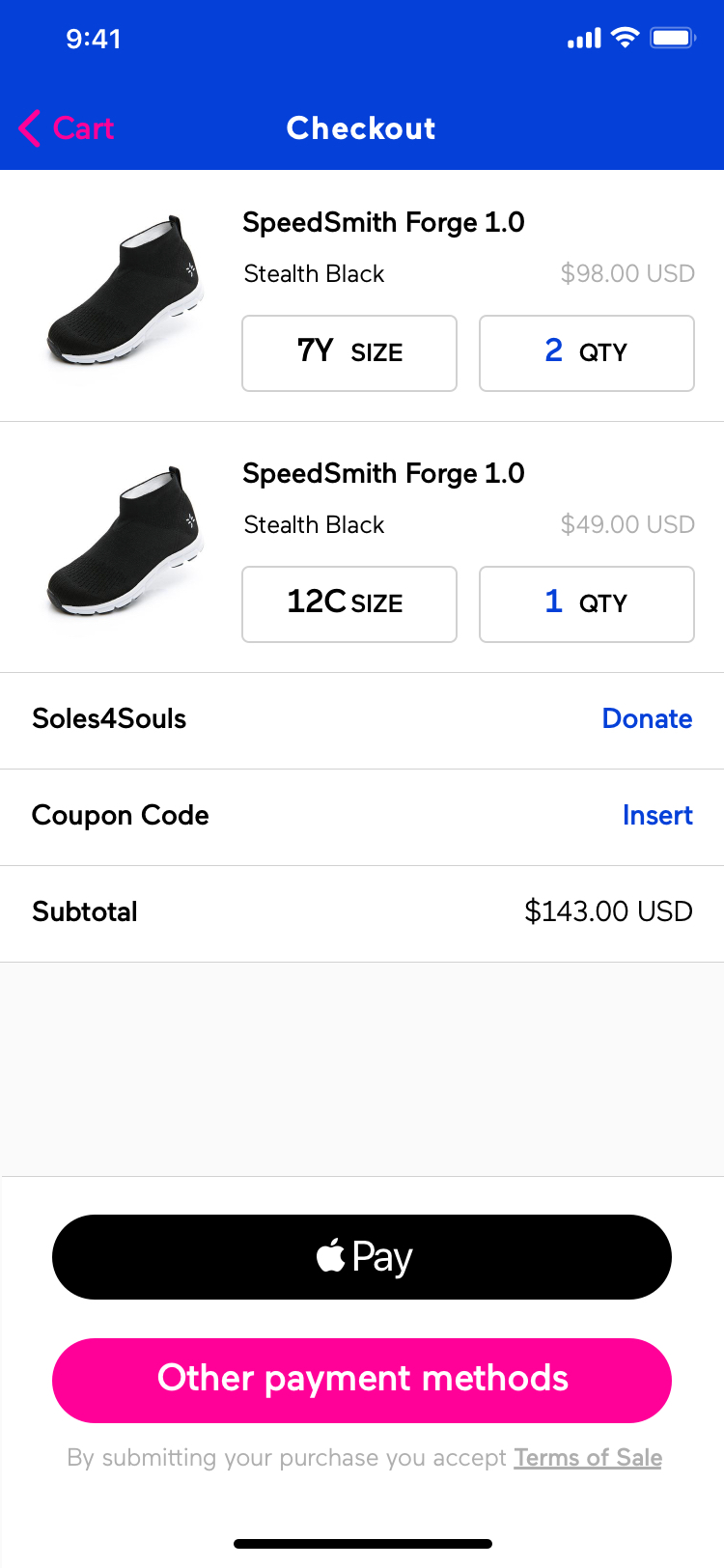
What SPEEDSMITH offered was a one-stop service that busy parents could buy shoes by knowing the measured size and placing an order. Hence, reduce parents’ time and struggles on children’s foot.
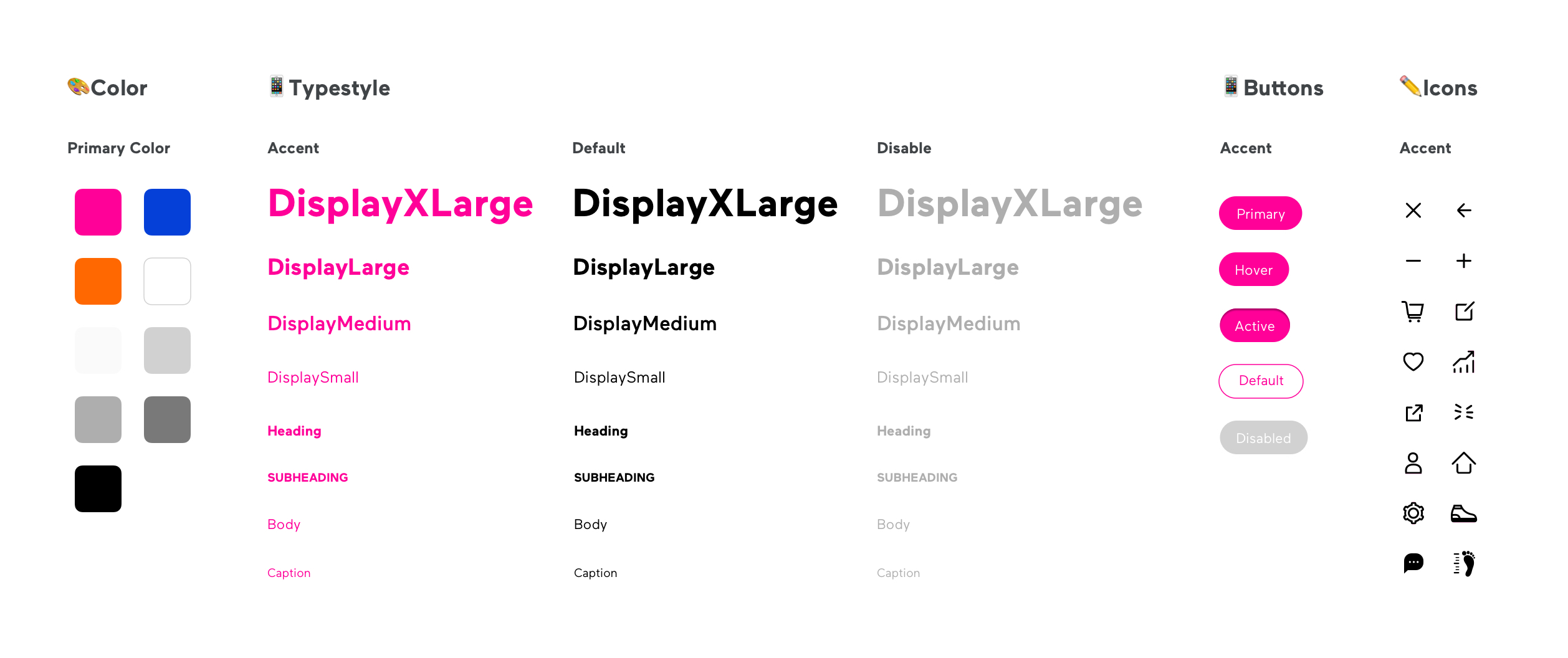
Design System Language
While SPEEDSMITH was a new app and brand in the market, the design component and UI were still in the early stage, but a simple and shared design library allowed engineers to keep the UI consistent.
Illustration
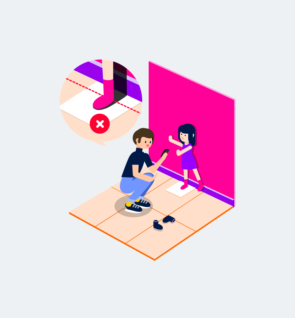
Images with the isometric (3D) view were an appropriate way to represent the SPEEDSMITH Brand and App. On top of that, the final illustration of the tutorial provides a clear and significant direction with the vibrant energy of youth.



Takeaway
Challenges
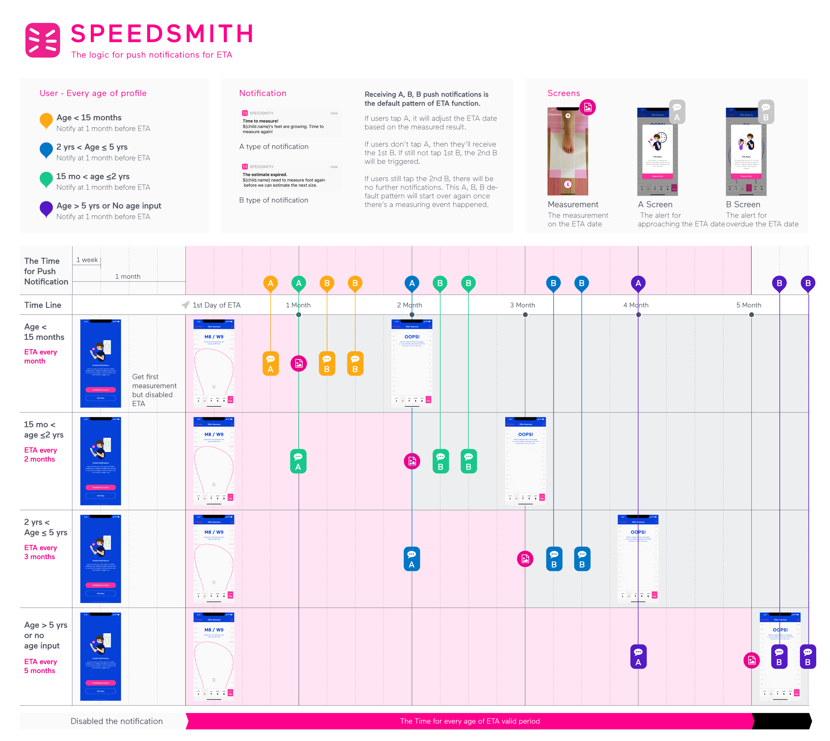
I commissioned the design work on this project in 2017, and the biggest challenge was a struggle with shoes and feet size compatibility. Children's feet sizes do not like adults’ sizes; children's sizes can grow quickly and unpredictably. So I spent a lot of time creating a logical notification system so that parents can comprehensively know the stage ofchildren's sizes now and future.
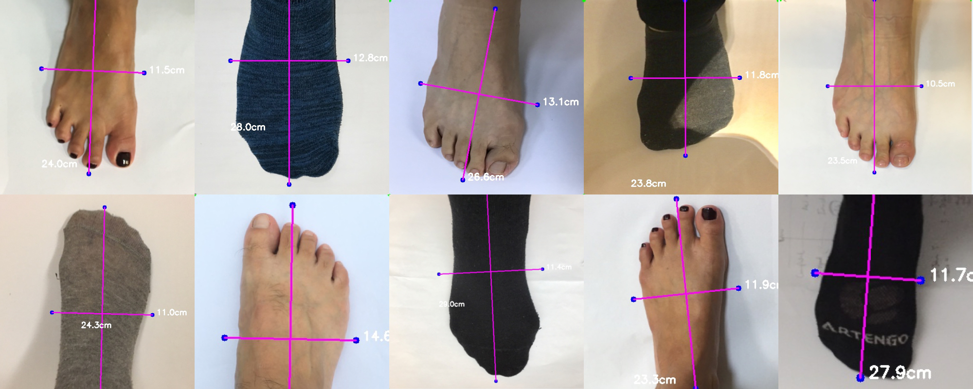
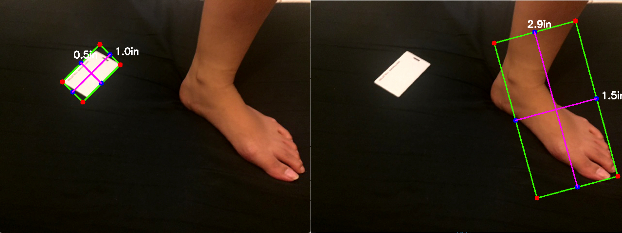
Also, the Roam & Wander tech team joined to develop a function by taking the perfect photo of your feet from an iPhone camera to create accurate 3D models; there were some technical constraints that I needed to come up with a simple but effortless flow and led users to buy SPEEDSMITH’s product.
Lastly, what can be improved?
The SPEEDSMITH App design was a 5-month project from September 2017 to February 2018, I put a lot of effort into delivering delight experience but reduced the technical constraints that meet parents’ struggles with children's rapid feet-growths cycle. But I couldn’t follow up in more detail or test data from the client side after releasing the app.
In the future, I would like to strengthen the engagement between the product and measurement, which can impact customer revenue directly.
- Strengthen the engagement between the product and measurement.
- Offer a conversion size in different standards
- A sharing/rating system of SPEEDSMITH products.
Update!
App rating: ★★★★★ 4.8
Before SPEEDSMITH was acquired, it was a 4.8 rating on the App store. In April 2020, a USA company, Awesome sports acquired the SPEEDSMITH App and patents for the feet mapping system, and sunset the App in the same month.
