
A tailored meal-selected experience for new users
An easy way to measure kids foot and buying the super-functional shoes for parents.
Marley Spoon ・UI/UX Designer ・ 2018
SpeedSmith ・ Product Designer ・ 2018
Duration
1 week
My Role
My Role
UI/UX Design
iOS App
Product design
Disciplines
Interviews Preference Wireframes
Mockups
Prototyping
Published
October, 2018
Made with
Marley Spoon
iOS App
iOS App
Website
Overview
Marley Spoon is a meal kit subscription service based in Berlin. It also operates in the U.S. and four European countries, including Germany.
With Marley Spoon, you can choose the dishes from the weekly menu. Decide how many foods you need and what kind of dishes you like. It's easy to control the amount of food, and no need for food waste. Marley Spoon provides a wild range recipe you can follow and browse through from the web and apps. Also, the meals are cheaper per person if you buy more meals per week.
Problem statement
- Users have often struggled with understanding the interface and misunderstood ordering system works.
- Users cancel their first order because they are underwhelming both functionally and emotionally or feel dispirited from UI/UX because it is confusing and complicated.
My role
I worked on this design challenge as a UI/UX Designer. My main task was to offer a new approach to Marley Spoon, redesign the onboarding flow, and identify the use case for the newly subscribed customer.
My goal
To design a better onboarding flow for new users, they can easily understand the service and workflow until successful completion.
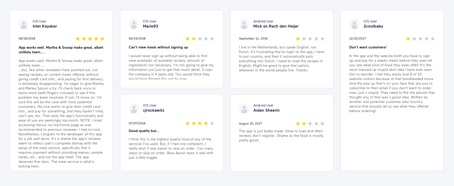
Current reviews
I decided to find out more problems and onboarding issues before into design. App Store and Google Play can always be a place for users to leave feedback and show the crucial and honest voice and gain insight directly. Baes on my experiences, ratings and reviews are a big matter in App Store.
What are key pain points I found:
- The ordering process is frustrating, complicated and lacks informative content of service.
- The users need to purchase the first delivery if they want to see more details.
- Even more, newly users need to give personal and payment information first.
- It's not English friendly for non-English speaking countries as Marley Spoon is an international service.
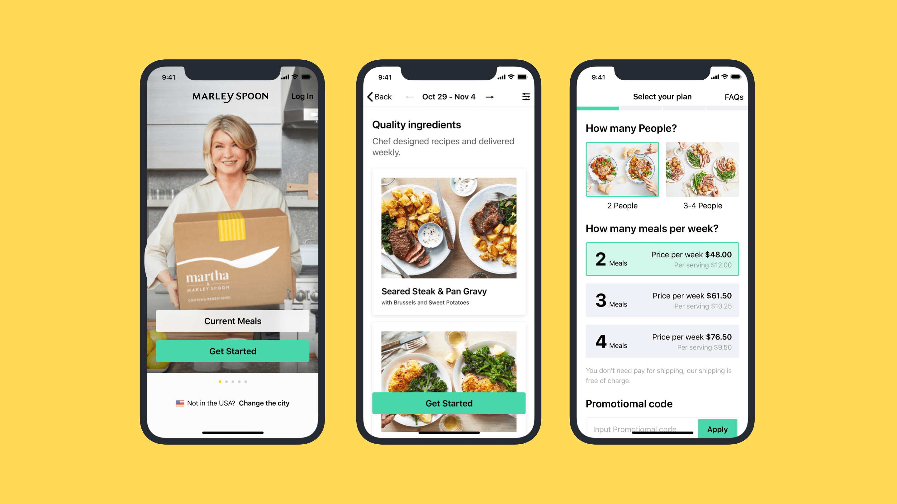
After I checked these reviews, I should confirm these frustrating situations by myself. I found the customers couldn't do anything in the current apps except registration.
The signup process includes box selection, delivery arrangement, payment, and choosing the first week's meals. You can't view any dishes before the ordering process which a customer has to go through 4 steps and review the recent menu in the end. It was hard to convince a new user for the first subscription, not to mention user-unfriendly interfaces.
Premise
Ideation
People would give it an opportunity for their first meal box for Marley Spoon because of Martha Stewart's personality and successful brand image. Her fame might attract beginners and sceptical home chefs. They can learn and enjoy the recipes from Martha Stewart directly.
The first idea I came out with was onboarding flow is a good touchpoint. The new user no need to browse everything through the website beforehand. Instead, providing a simple, painless experience and key values would be my design key point. Also, I planned to achieve it by providing intuition and reducing the number of input fields to help ensure the user continued through to the end.
But how would you make the onboarding process clear to customers that they subscribe to their first meal box? How could we make the ordering process as seamless and easy as possible? I also considered the scenario where the customers want to browse first? What is the main reason that people would give it a try? Even more, what's the biggest advantage that new customers want to subscribe to Marley Spoon?
I want to provide a win-win situation for our customers and help Marley Spoon acquires more customers during the onboarding process. These questions were a good start and helped me to dive into the design.
User research
Interviews & Surveys
I started with some interviews and surveys to validate my ideas to get answers to the following questions. In addition to recorded interviewees, I analyzed and classified each answer. To try to figure out the overall use case and root cause.
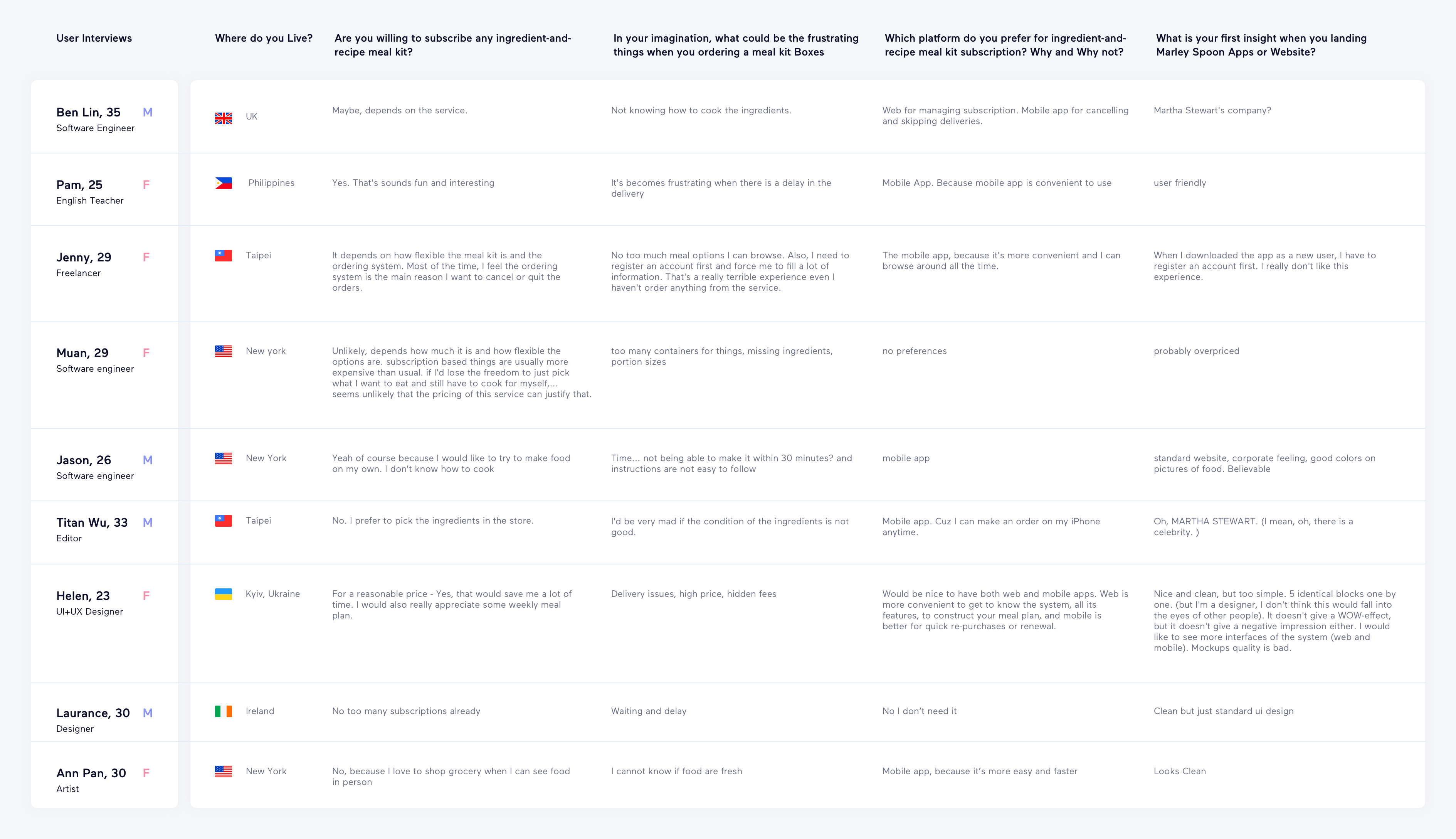
Survey
Would you like to register an account via social media (like Google, Facebook, Twitter..etc)?
Which platform do you prefer for ingredient-and-recipe meal kit subscription? Why and Why not?
Interviews & Surveys
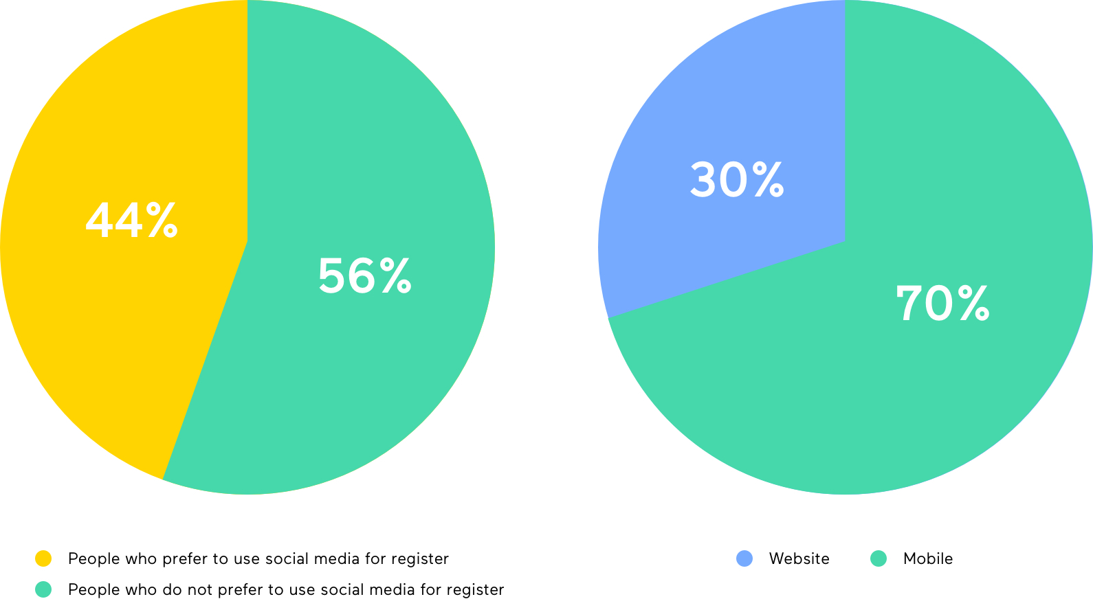
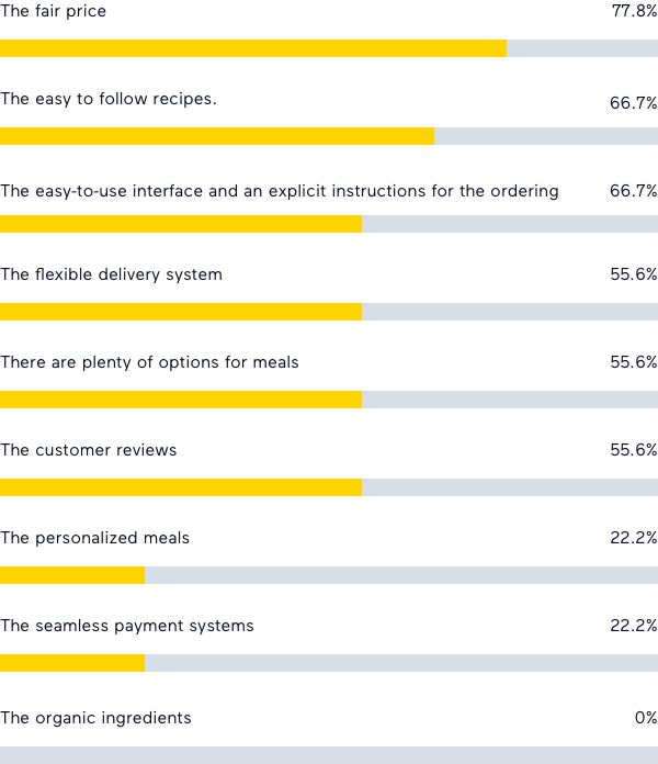
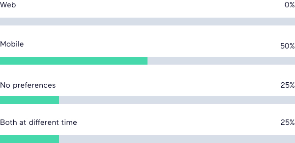
It took two days and collected some good insights from 9 people. I analysed and compiled information with 3 different charts. There were some interesting results:
- 50% of People would like to use social media as a signup account.
- As my survey, most people spent their time on smartphones to be willing to use mobile apps for managing subscriptions.
- The fair price is the most important that is the main reason why they would give it a try and subscribe to a meal kit.
- Males are cared about how easy to cook meals, and females have cared about ingredients fresh.
- The seamless experience and interface are both important for ordering and managing the subscription.
What's the key value if you are going to order an ingredient-and-recipe meal kit
Which platform do you prefer for ingredient-and-recipe meal kit subscription
Into Wireframes
I transformed user reviews and user's expectations into my wireframes. At the same time, I browsed some competitor apps and websites, such as Blue Apron, Plated, Hello Fresh, Home Chef, The Cook’s Grocer and Sun Basket.
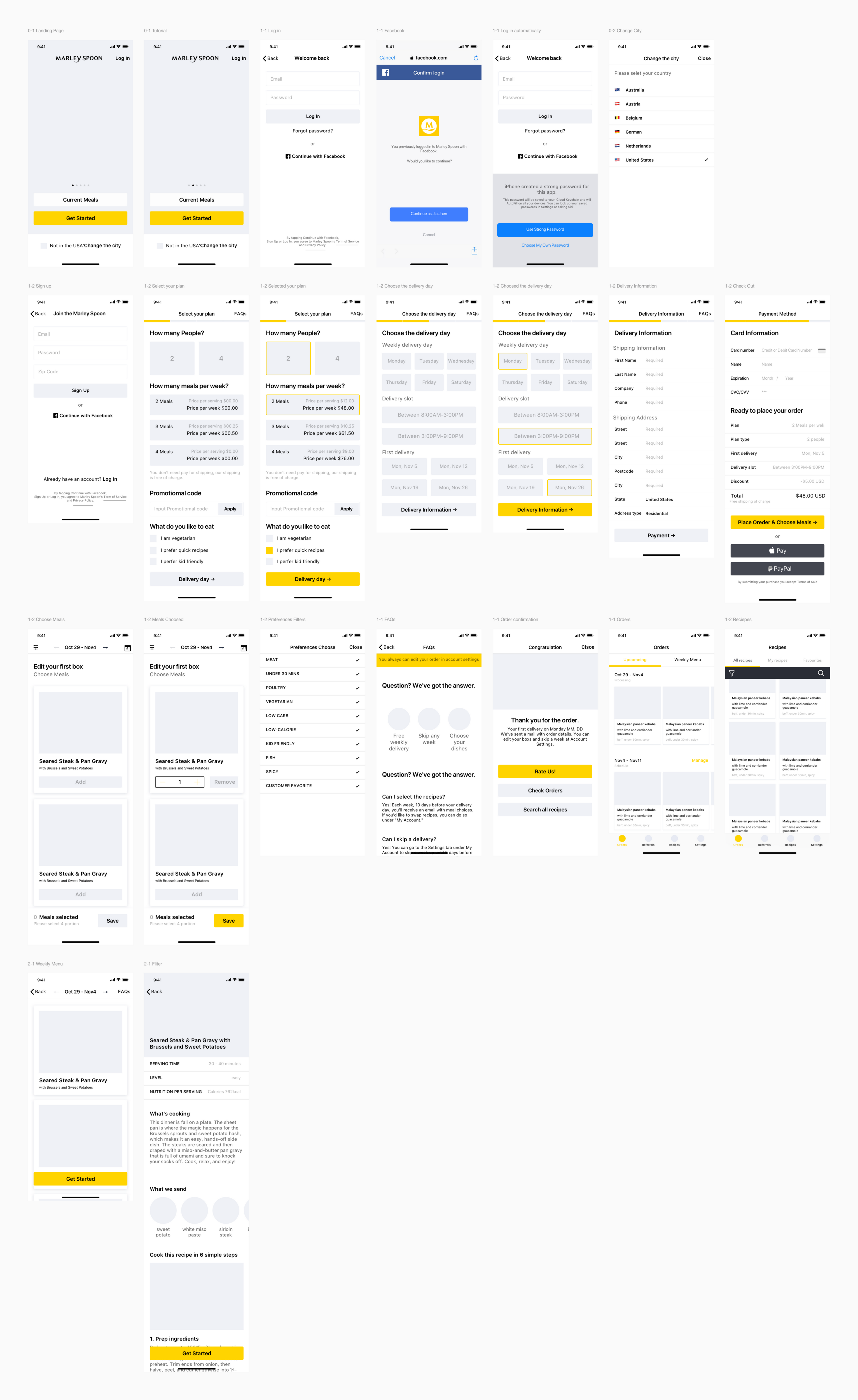
Visual & prototype design
To provide a better solution for onboarding flow. I made 2 prototypes to validate my ideas and design assumptions. During this process, I added more touchpoints for the user in the flow and utilized animations to create a feeling of progress.
Here are 2 prototypes to demonstrate the onboarding flow by useing ProtoPie. The outcome shows a positive look and feels that user can easily start their journey on Marly Spoon.