
Infostellar・January 2019 - February 2020
Branding · UI/UX · Design Language
Branding · UI/UX · Design Language
A consistent and refined design language across the Infostellar brand.
A consistent and refined design language across the Infostellar brand
Duration
12 months
My Role
My Role
Product design
Product design
Disciplines
Brand experience, Corporate identity
Design system, UI/UX
Published
February, 2020
Made with
Infostellar, Inc.
The Challenge
Overview
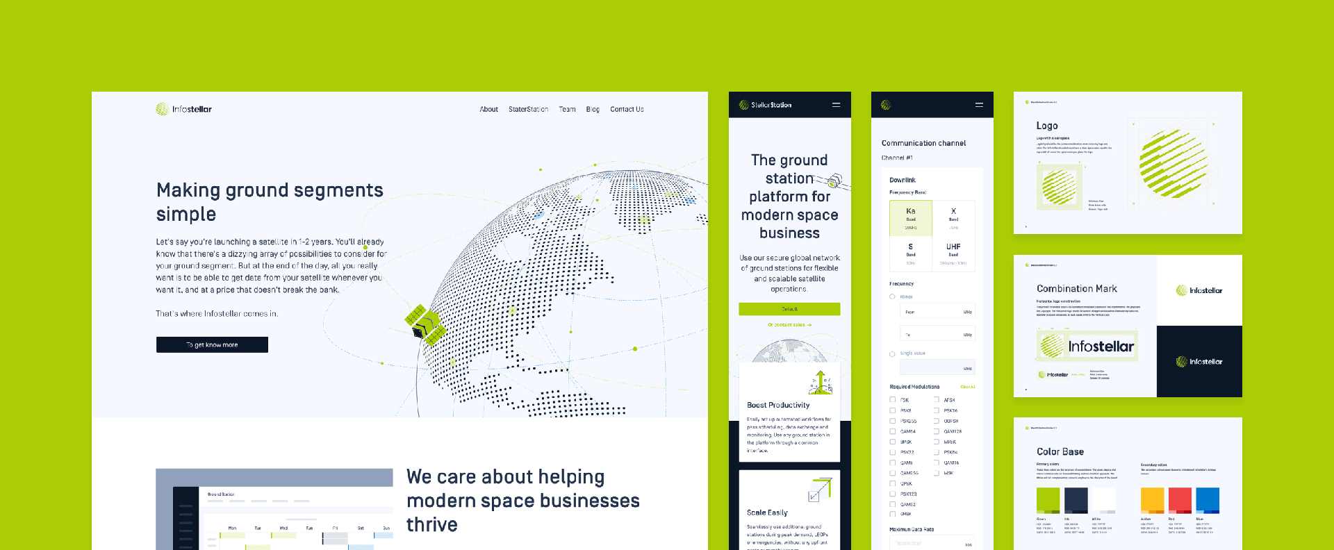
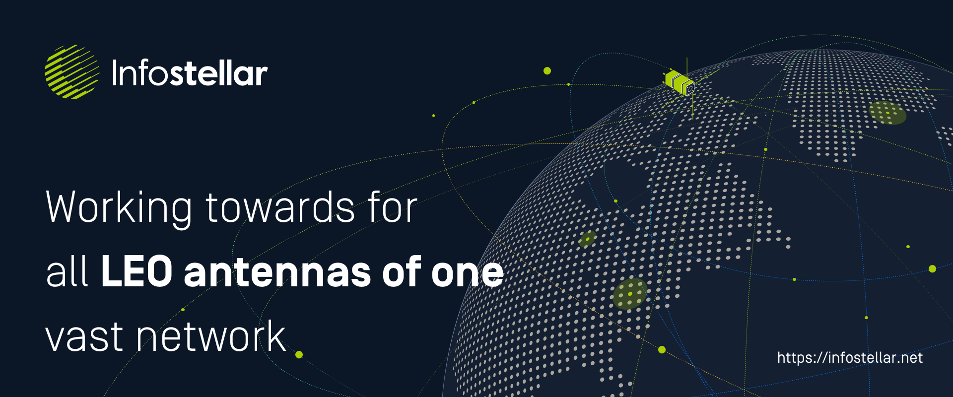
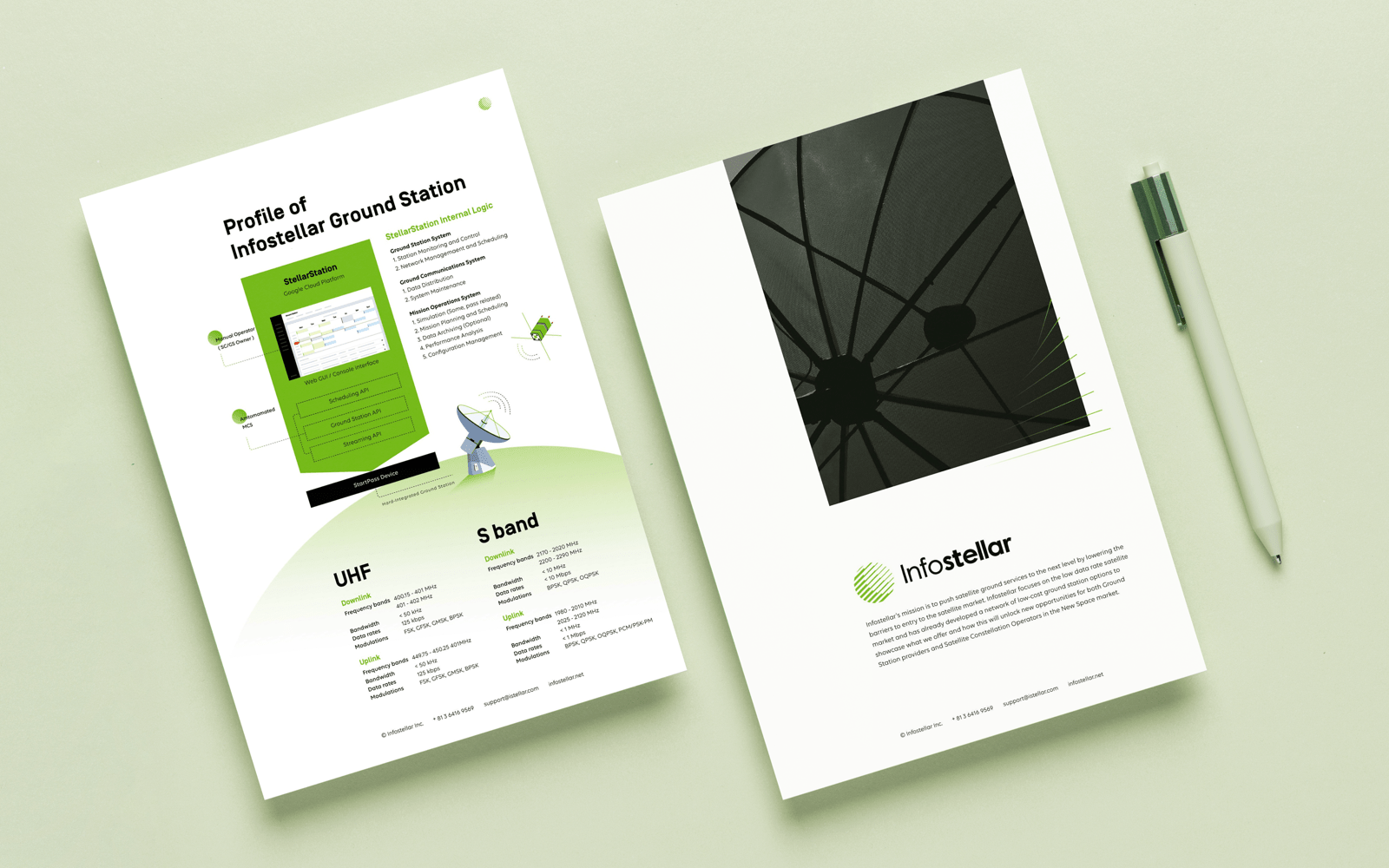
Infostellar is a Japanese Ground Segment as a Service (GSaaS) startup that provides an all-in-one cloud-based network web platform. Today, Infostellar supports all satellite data demands, bringing hundreds of antennas worldwide to the service of thousands of satellites. With their current StellarStation solution, both products' merge allows anyone to become a satellite operator - with less idling and operating at real-time speeds.
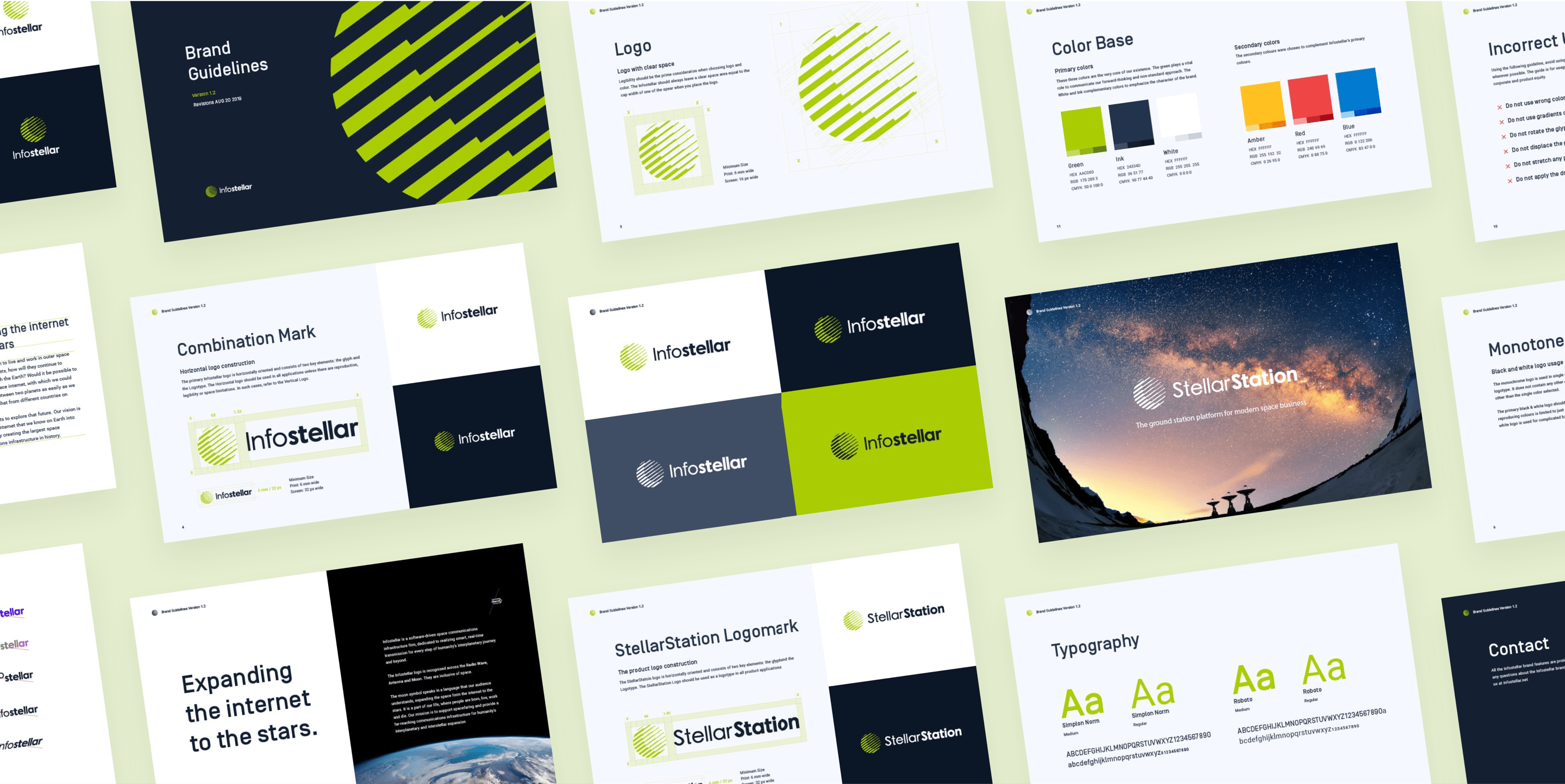
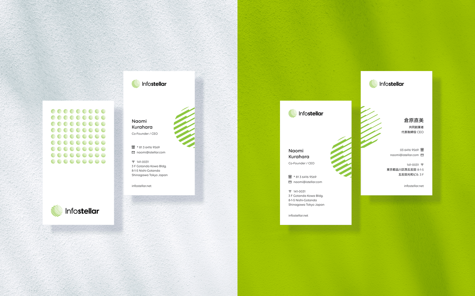
In the middle of 2019, the first internal branding guideline was released! It was a relatively simple guide that helped all employees and customers use logos consistently and adequately and aided a tone for building identification and recognition.
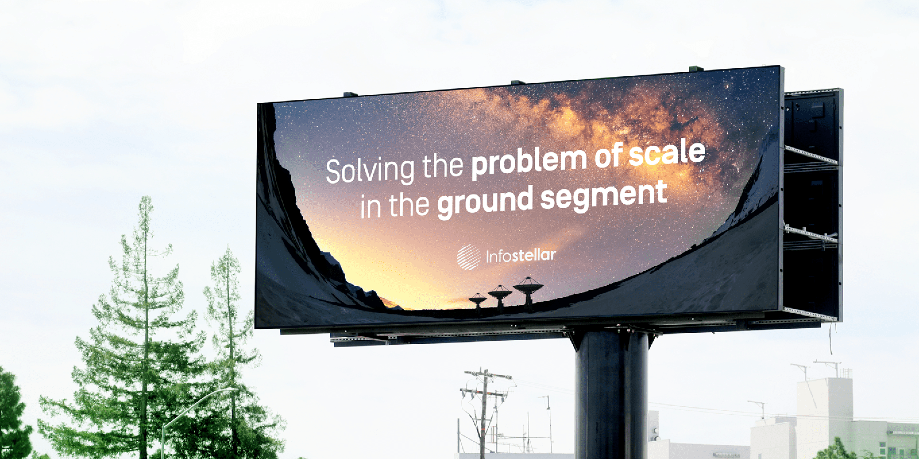
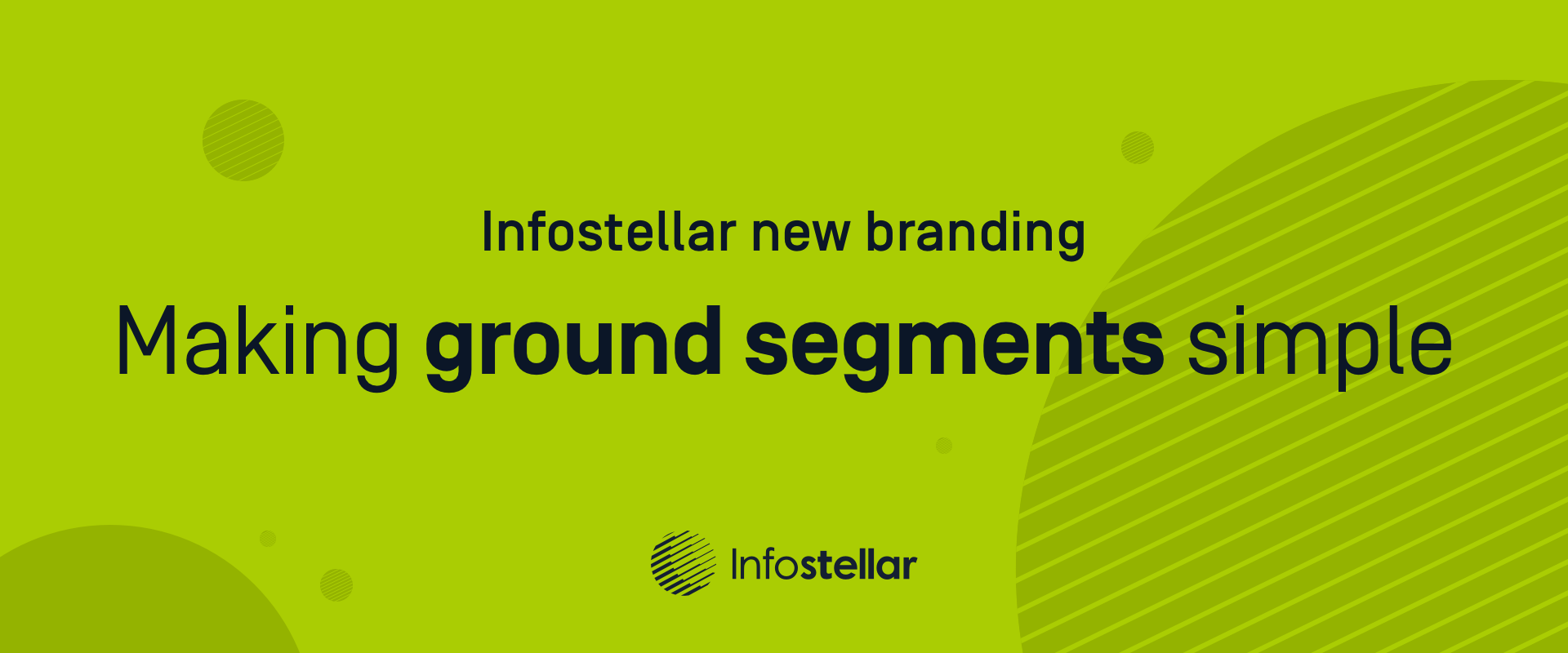
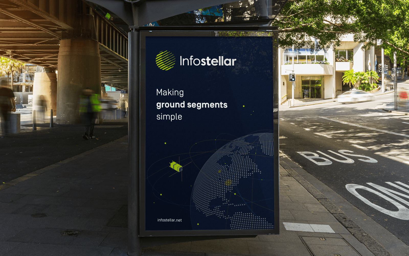
In February 2020, we were happy to release our Press Resource with our new website. Our goal was to develop a harmonious combination of various modes a consumer uses to interact with a brand. The Infostellar new brand attempted to create a general atmosphere of goodwill, dependability, or trust to create an association between the brand and a specific need or emotion.
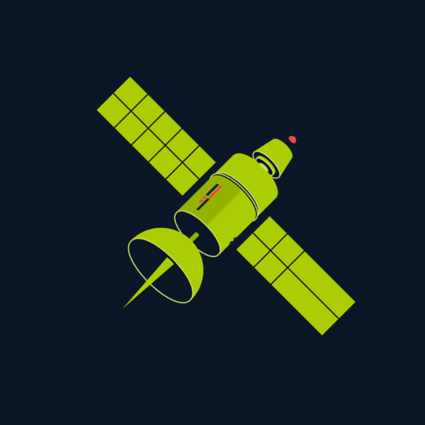
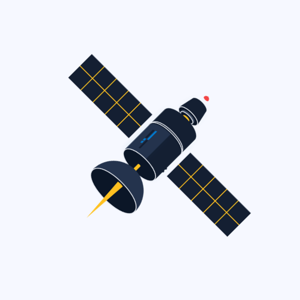
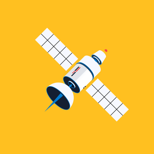
All Images Evolved Over A Year
The newest Infostellar was clean, fresh, and innovative. The brand experience was about creating a sensory user experience in order to become memorable to consumers. And most important was establishing a place where connecting and engaging with the target audience, helping convert brand awareness to brand loyalty.
It took a year to accomplish the goal, all the images above evolved to look like this:
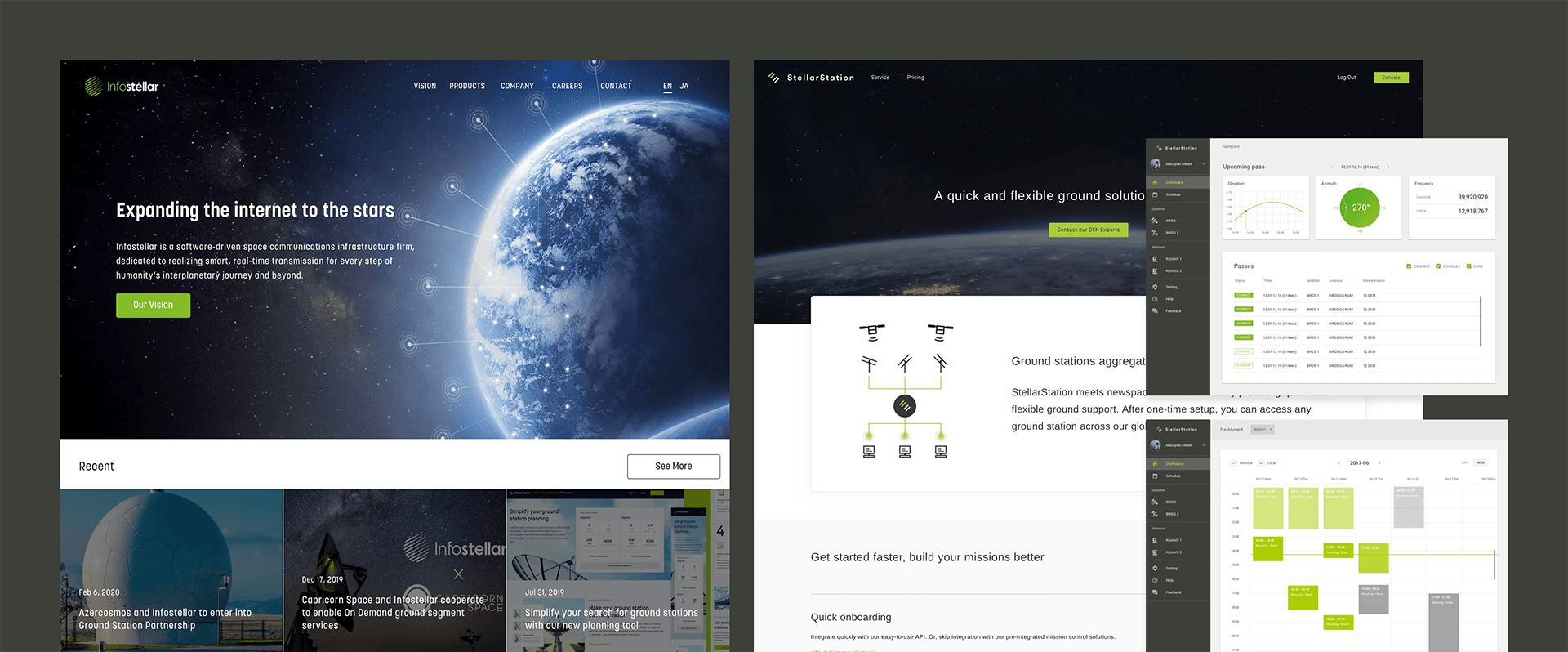
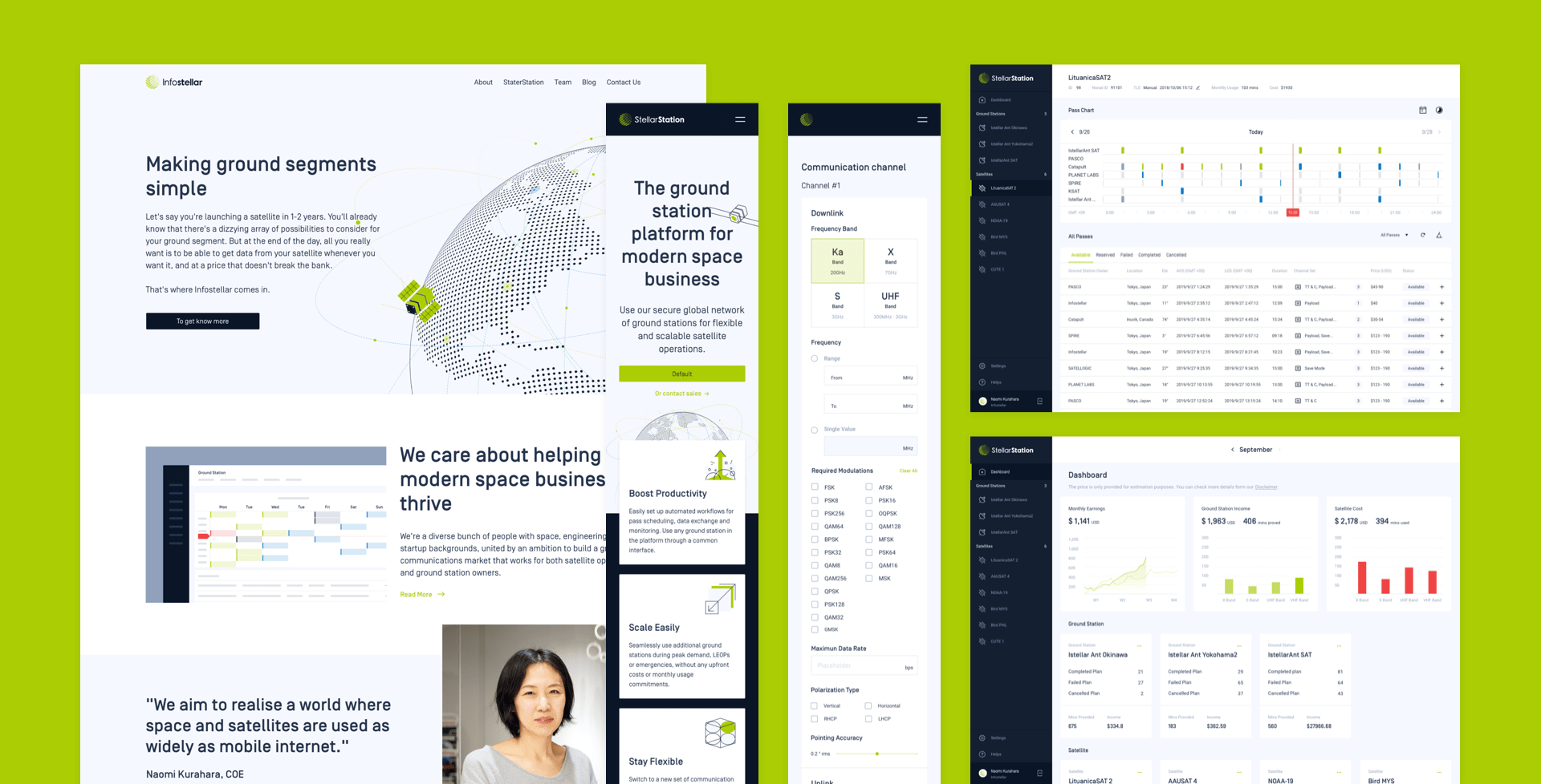
New brand experience
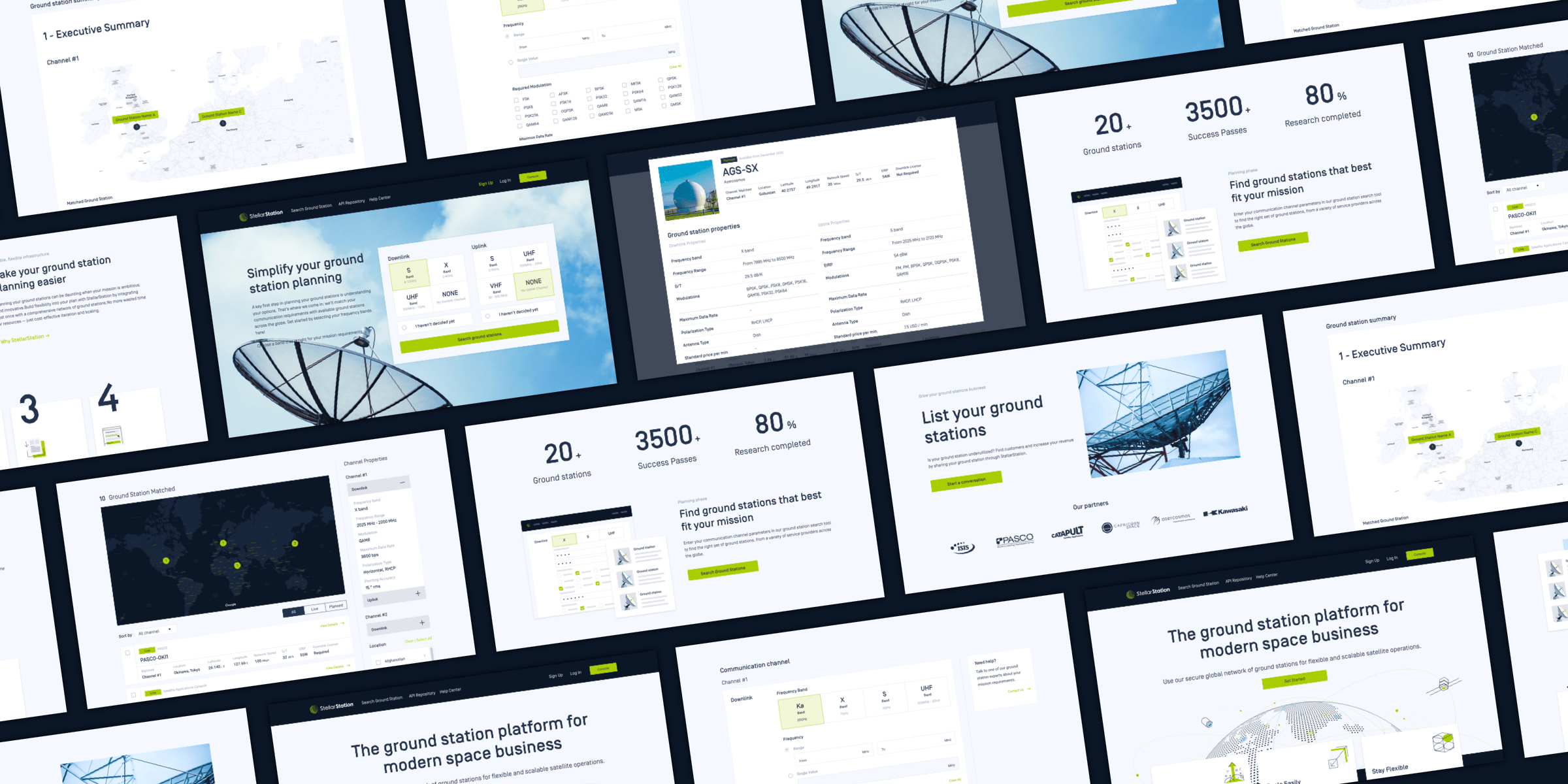
UI/UX design of ground station tool
My Role
I joined Infostellar as the first designer which a work environment with many space scientists, engineers and experts. My responsibility was increasing the customer' and the company's brand awareness by building a brand system with goodwill, trustful and reliable emotions from internal to external.
It was a big challenge which not only created a branding guild but also needed to restructure all the marketing resources and UI and UX work on a web platform. Here are the key objectives for this challenge:

Restructure
Brand tone, voice, look and feel for Brand strategy

Scalable
Logos, Colours, Font family, layout and illustration.

Extendable
Markting resources, design systems, UI/UX of products.
To achieve the goals above, a brand guideline can help me to extend the content of the website, platform, advertisement, and similar marketing collateral, etc. It was a necessary foundation where impacted the company as a whole.
Before and After
Problem Statement
Mainly people in the company didn't notice the problem of the branding. Basically, there was only the logo files without any strict guide. They used it for random tasks; all they needed was a logo to display. However, it caused many different sizes and colours that communicated an unprofessional and inconsistent brand awareness and emotions.
Out of dated style & visual
Inconsistency logo identity
No guideline for logo usage
There were a couple of points I founded:
- Out of dated identity and visual
- Inconsistency logo identity
- Logo and Logotype is unrefined
- No any guideline for logo usage
- Many slightly different version of logos over the years.
- The confusing between Product and company logo.
Rebranding Process
1
Understanding
Comprehend the history behind the logo and brand. Got to know our competitors & audience background.
2
Refine the Core
Set up the interview and the questionnaire with stakeholders to get more perspectives of Infostellaer's brand.
3
Restructure
Improved the logo identity and restructured the look and feel of product side and company side.
4
Visualizing & Extend
Built a branding guide & extended the new brand identity to all design system in visualizing as many as possible.
1
Unearth the Core of The Brand
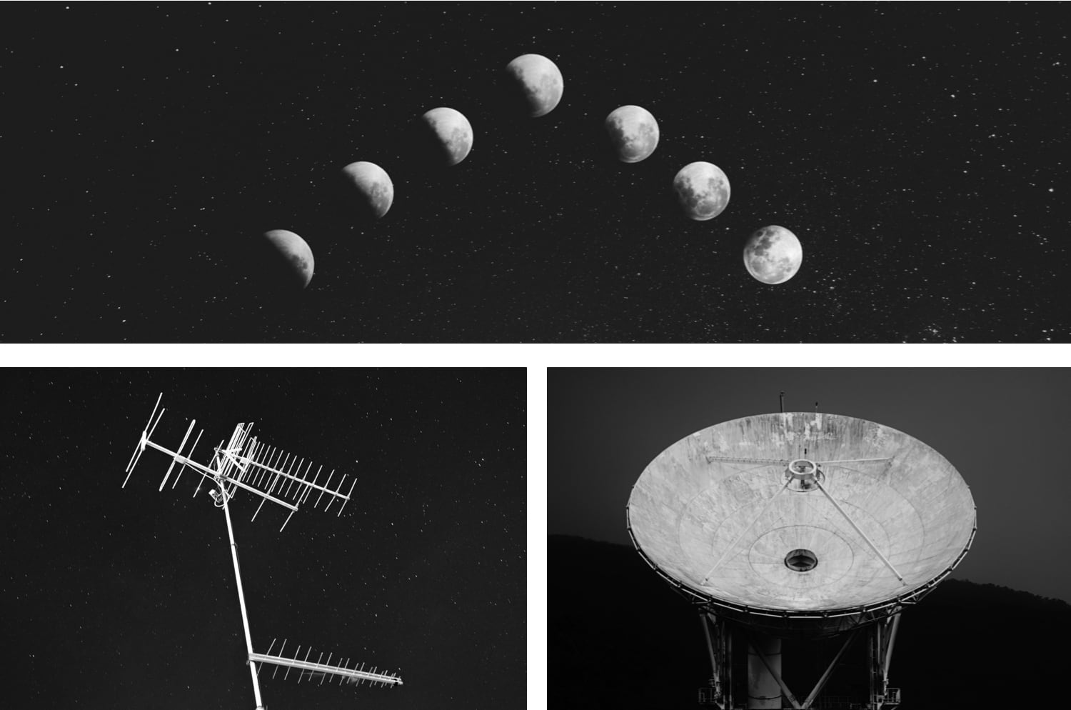
Imaginary signs
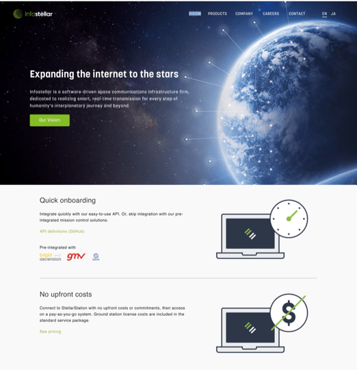
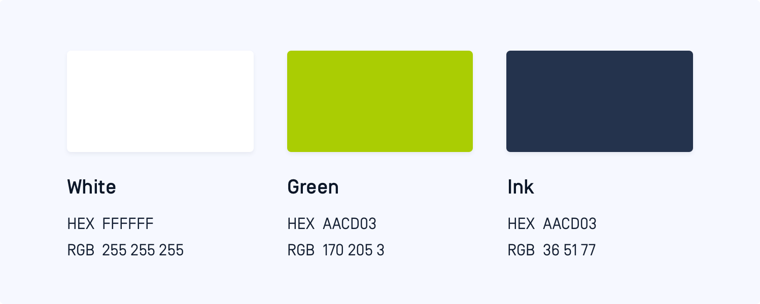
Infostellar had a clear definition of mission which made ground segments simple. The vision was defined that established a place where space and satellites are used as widely as mobile internet by our founders from day one.
The COO gave me more insight into the story behind the naming and logo design. The name was coming from a combination of "Information" and "Star”; a vision was to expand the internet to the stars. The logo was iconic and designed with three elements; Moon, Antena and Ground Station to deliver a vision of communication infrastructure to support humanity’s daily lives.

Reliable, Modern, Accessible and Professional is brand pillars.
2
Define the logo & logotype
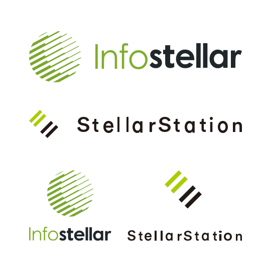
While the Infostellar logo contained three symbols "Radio wave", "Antenna" and "Moon" to express Infostellar's vision, I decided to keep the moon shape and story behind the concept. The iconic was perfect enough that there was no need to redesign it. What's needed was to refine it as it should be and establish a better balance between iconic and logotype.
White space
I noticed that the detail of the original logo didn't follow any grid and systems. The white space between the glyph and logotype didn't have clarity. This problem was also reflected in the product, StellarStation as well.
Colors
While we wanted to bring fresh, bright and modern emotions to our brand, the original colour of green was muddy. When the green colour was applied to the logomark, the readability had trouble when you went through the logotype. Therefore, I replaced the green colour (the green colour from the product logotype) and applied a dark colour to the whole logomark. Now, you can see a vivid logo with clear readability.
Infosetaller primary colors
Readability
3
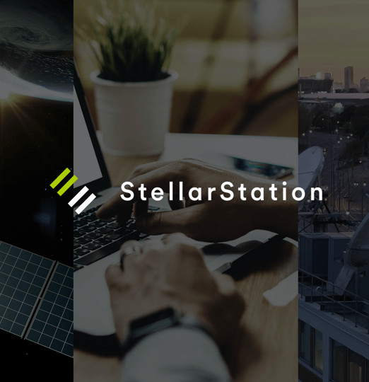
Restructure the StellarStation Logo
As StellarStation first product in Infostellar, there is no sign or clue that you can identify the relationship between the company and the product. I suggested keeping the Infostellar's glyph and replacing the font type of the logotype with Infostellar, and also applied to the same bright green colour to the product logotype. To eliminate the concern of logo, colours and logotype differences and strengthen the awareness of the brand consistently. It was just like Apple, dropbox and other well-known enterprises did.
Original logo (left) and final logo (right)
4
Invest Visual Identity
Develop a visual identity
While I got an agreement about keeping iconic with stakeholders. It was time to develop all philosophy into the design and naturally, the image for the entire branding experience. I started with two questionnaires which were Design adjectives and Visual style to get more insight into Infostellar of branding experience,
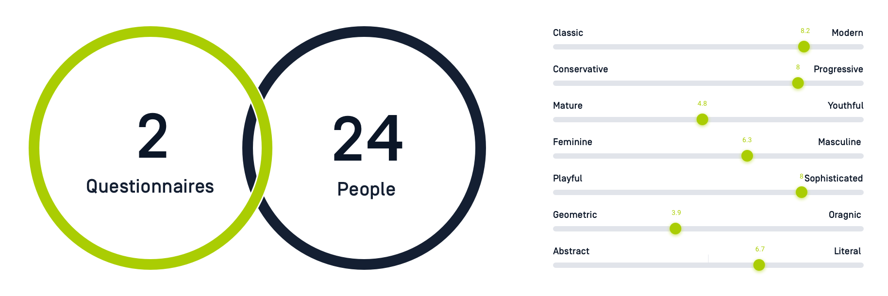
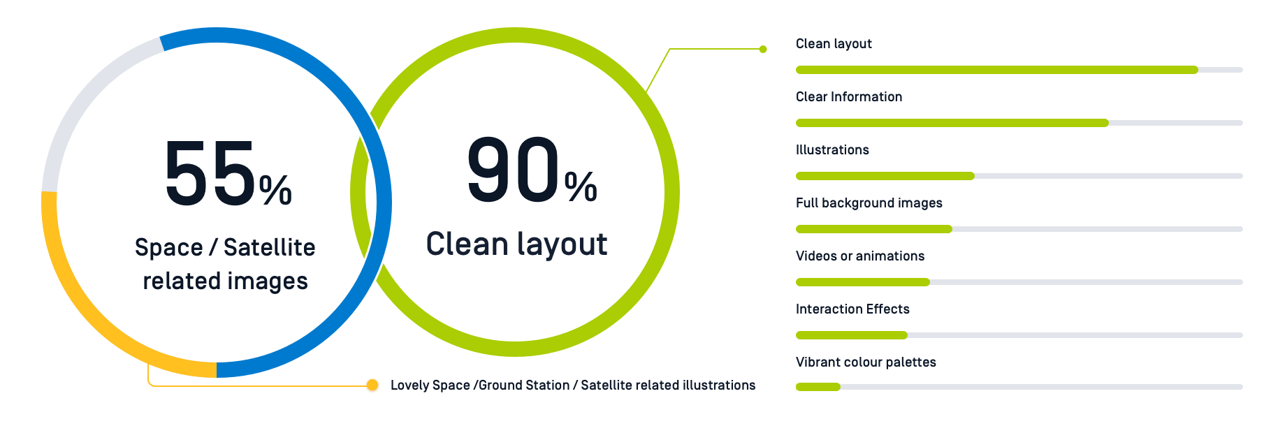
The results showed an intresting point of view
Almost 95% of webs have an image(s) of the View from Space or Earth's Countries and Coastlines.
67% of webs were used for Big Background Images as key visual design.
36% of people feel Dark and bright colours are used alternately.
Illustrations are less used as the visual design approach.
Most of the good webs support the micro-interactions
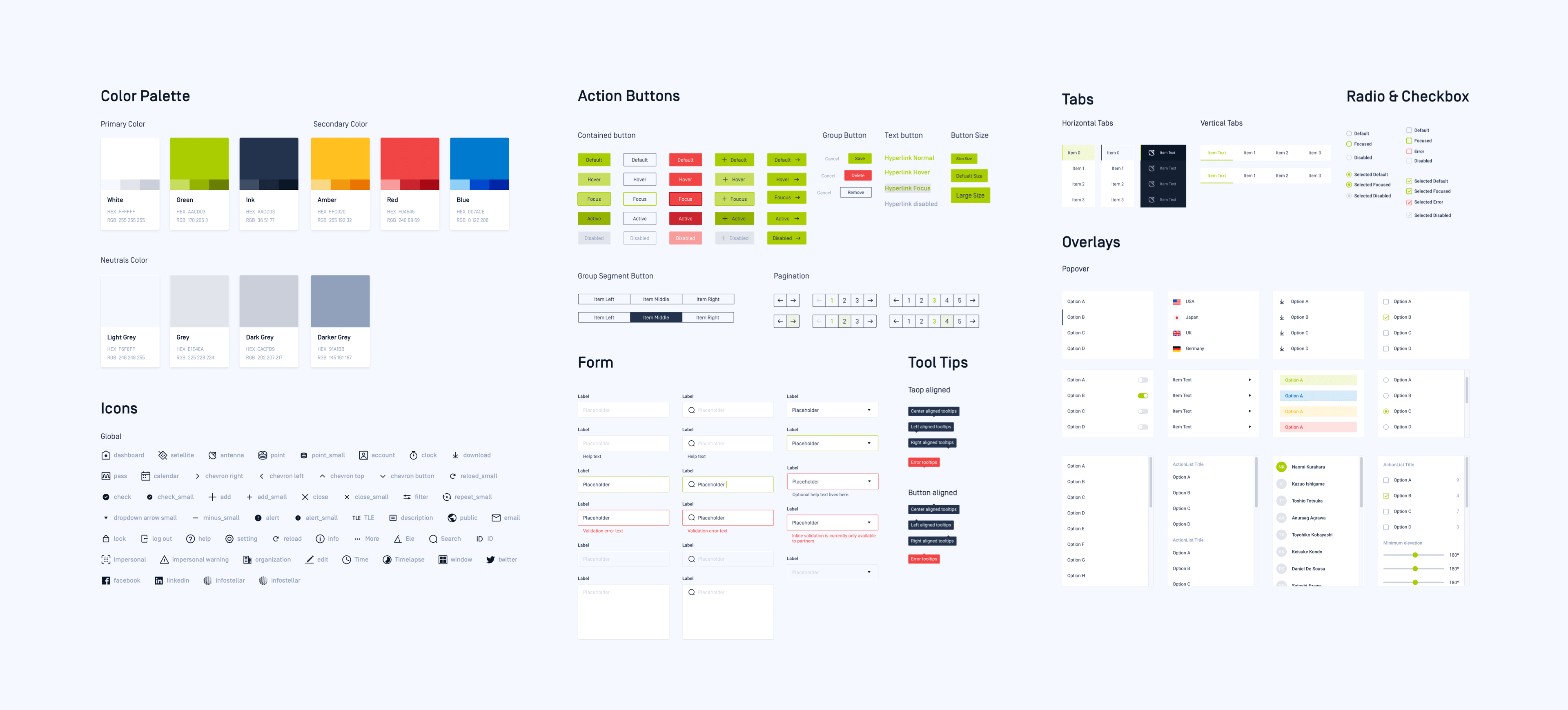
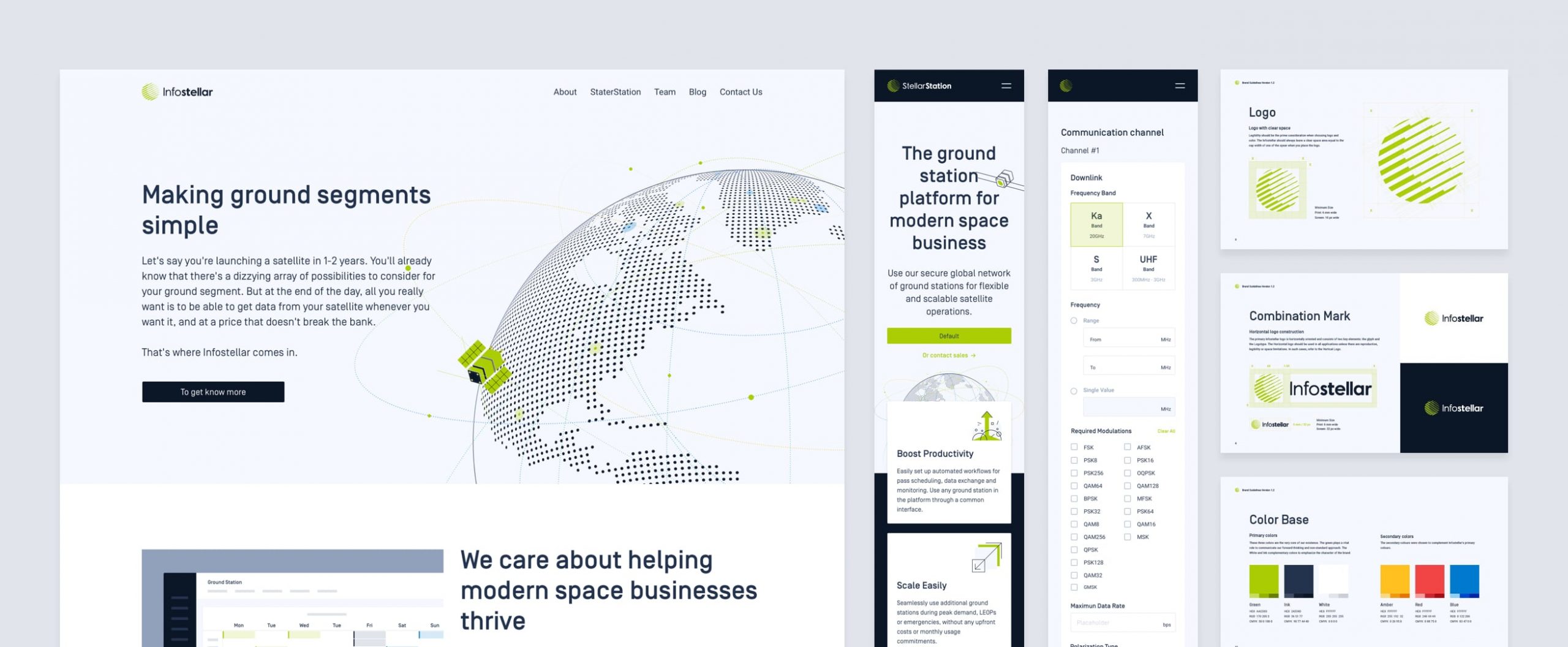
A design system for digital product
5
Create a style system
Once the colours and font brand images were defined, I immediately went to the next challenge; A Design System across our platforms. Unlike branding and visual identity, design systems were a logical move from the web, various platforms, and factors. It was not only across branding, screens, platforms, and our users but also crucial when it comes to driving consistency of brand and experience across products.
As a product designer, everything I did needed to be able to scale. While the operators needed to coordinate their system with StellarStation, the UI component played an important role were needed to be less distracting, had good readability and lead to clarity in our platform.
The design system was important so that engineers can check the UI details, accurate specs, assets and code for UI design adjustment before they start to develop but also a bridge that allows the designer to keep the consistency of the style. Now, I was glad we replaced all the old styles and gave a new look to UI and UX.
Lastly, Design Language Cross Everywhere.
I was determined to restructure and roll out the brand identity if I can join Infostellar. It was almost rebranding and crafted all the look and feel. If a brand restructures is to be successful, I needed to make a full commitment. It wouldn’t just place a logo on the website and tweak the colours and pixels.
I had been working with Infostellar’s team tirelessly to apply the brand system to every facet of the company and the products. It’s been a ton of work with a lot of dependencies and co-works. Many things needed to be revisited again and again as elements of the brand evolved simultaneously. But it's completely worth it. Thanks to all the team members and engineers for making it come to real life.
Learning & Takeaway
Before I joined Inforstellar, I had a vision that would be great if I could rebrand the company's identity. I joined the company as a product designer, the manly responsibility was focused on the UI and UX of the platform. However, when I took the initiative and idea for this project, I wanted to build a friendly and trendy veneer in the space industry.
It wasn't an easy task when I brought this proposal out, especially since I wanted to replace an existing brand system fragmentary. Thus, it was an intensive year everyone was working hard on this progress. To launch a new brand system and applied to every corner, we completed a lot of good brand experiences but also faced many struggles.
As you can see, our office still useing the previous logo.
This project taught me a lot about the design thinking process, but also prioritization. It was good to conduct a leap in an early phase, but gradual experiments might take time but be relatively safer.
To see people interact with my design and gain feedback from peers and customers. The value of the brand mission had been extended. This project helped broaden my thinking to people who don't know the impact of design and also built a stronger relationship with team members. The design can be powerful.